WorkStudioLabPeopleInsights
Book a consultationLogin
A child reading, sitting on a stack of books
← WORK·BRIGHT AUTISM

Bright Autism

Every child is bright in their own way.
WHAT WE DID
Brand strategyVisual identityNamingMessaging architecturePackaging designProduct architectureUX and UI designSocial content systemArt directionPodcast concept and copyEducational content frameworkDesign system and guidelines
SECTORConsumer health · sensory products
DISCIPLINESStrategy · Naming · Packaging · UX/UI · Content · Podcast · Design system
BUILT FORZaimella
BUILTFrom the ground up
SCROLL
THE CONTEXT

Bright Autism was created by Zaimella to support families raising children on the autism spectrum with empathy, clarity and care.

Grounded in scientific rigour and shaped by real family insight, it brings together sensory-friendly products, expert guidance and one human message: every child carries a unique kind of brilliance. We were asked to build the whole thing from the ground up.

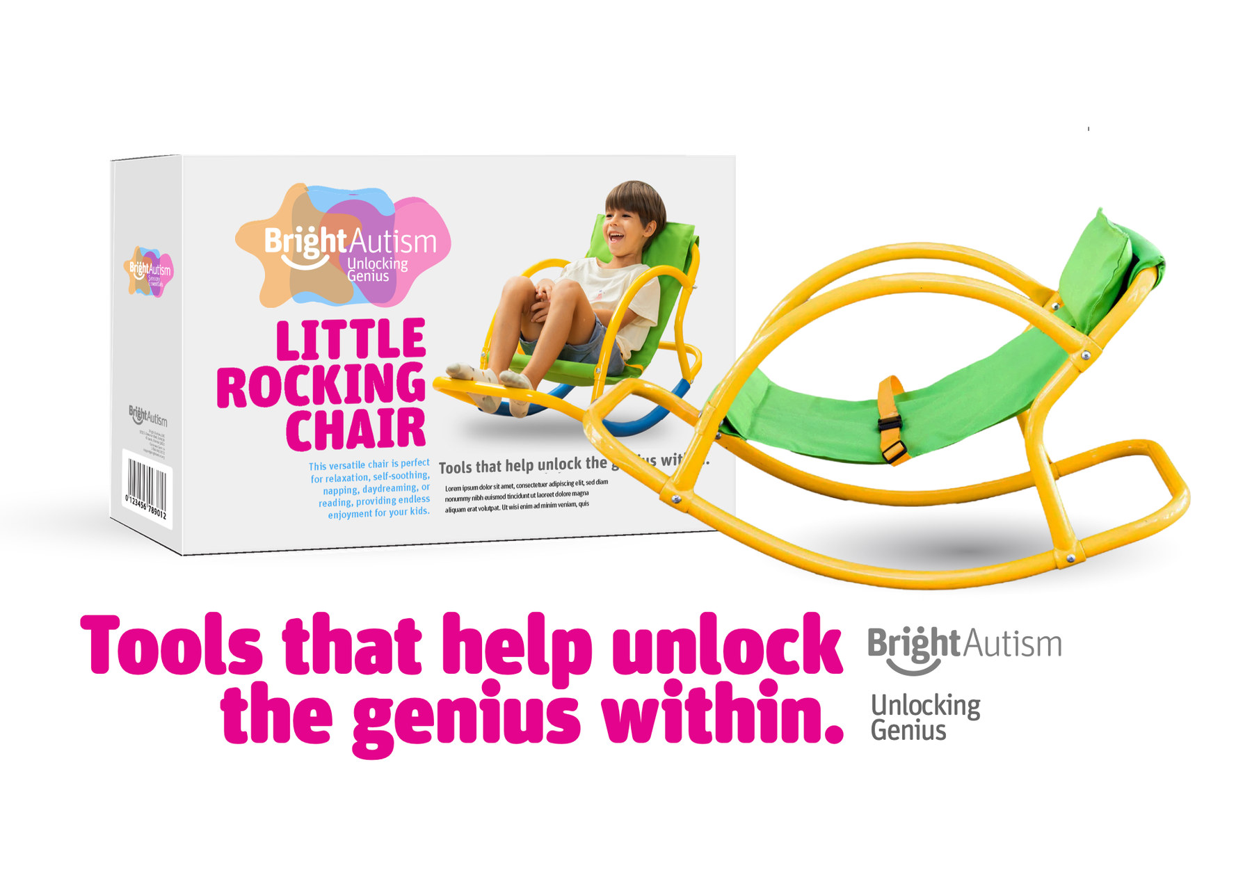
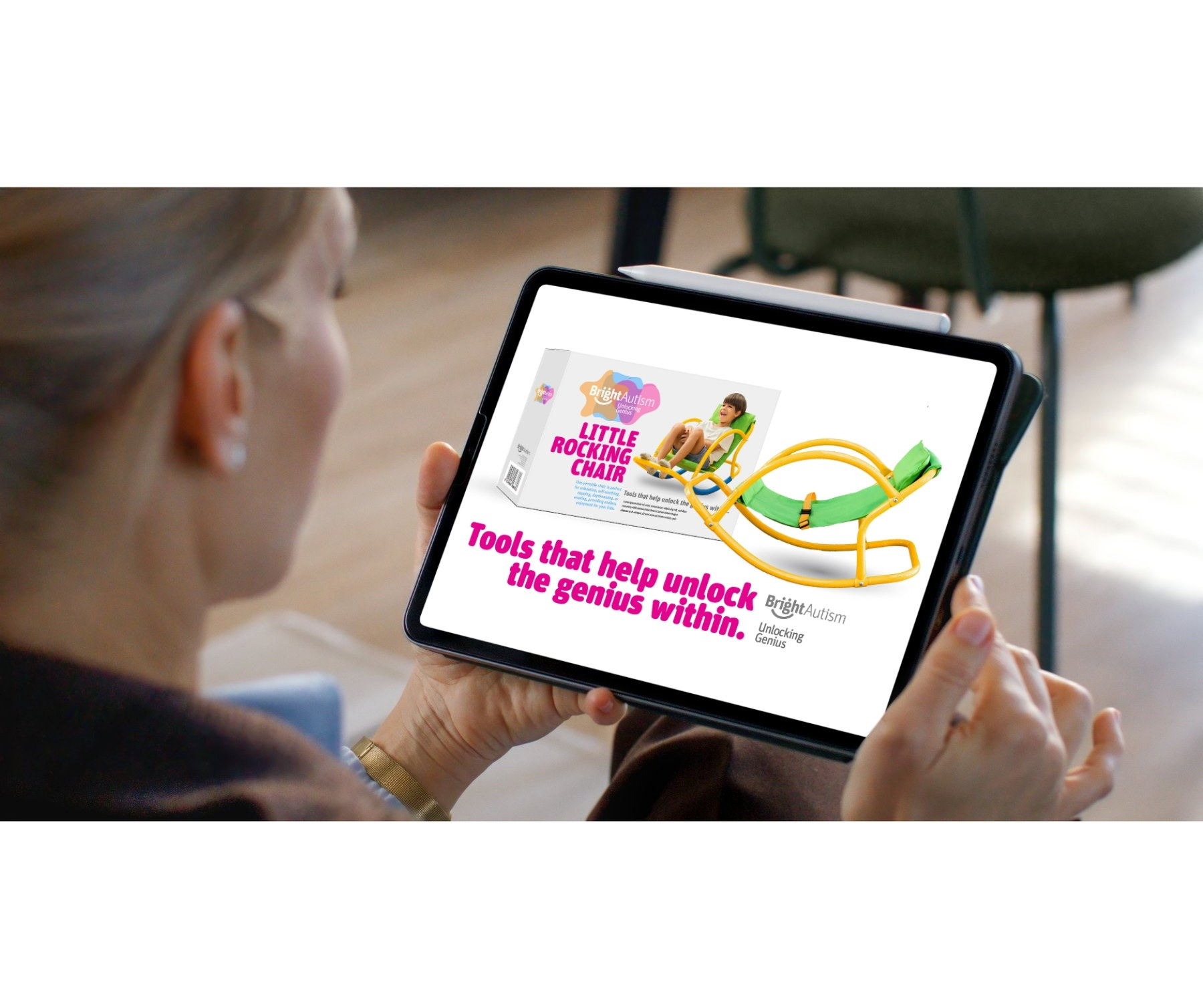
Little Rocking Chair packaging
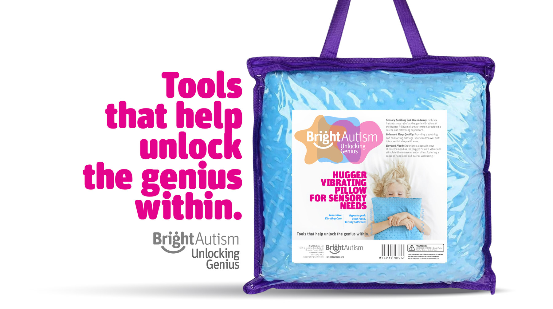
TOOLS THAT HELP UNLOCK THE GENIUS WITHIN
THE CHALLENGE

The category was getting it wrong.

Most autism-related brands speak in clinical, cold or overly complex language. The visuals feel institutional, or worse, overwhelming for the very children and families they are trying to reach.

The dominant emotional register is medical or pitying. Neither serves a parent raising a child with extraordinary potential. Zaimella asked for the opposite: a brand that feels like a trusted friend, speaks clearly and beautifully to both parent and child, and treats neurodivergence as a strength rather than a condition to manage.

THE INSIGHT
Your child is not broken. They are simply bright in their own way.
Parents of autistic children do not only need better products. They need to feel seen, by a brand that understands the complexity of their daily life without making it heavier. One that holds space for the hard days and still says the thing they need to hear. Sensory-aware design, emotionally intelligent messaging and real education, together, move the whole category from clinical to aspirational.
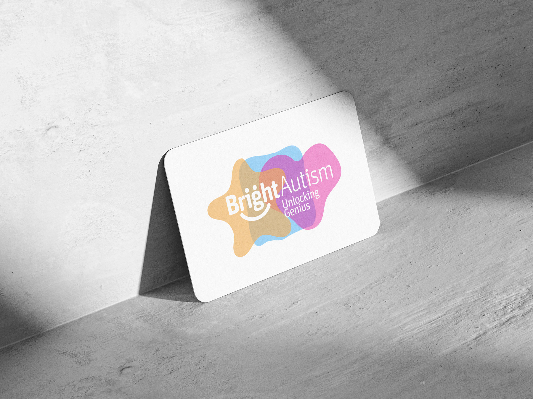
The Bright Autism mark on a card
THE MARK · A SHAPE THAT NEVER READS AS A DIAGNOSIS
THE EXECUTION

A world calm enough for a child, and clear enough for a parent at midnight.

A soft welcoming identity, a compassionate tone of voice, a pastel palette, organic shapes and playful illustration. Every element balanced for sensory sensitivity, emotional warmth and quiet optimism.

The same care shaped the packaging and the digital presence: clear, reassuring and emotionally resonant at every touchpoint, whether the person holding it is six or thirty-six.

THE PRODUCT ARCHITECTURE

Tools, named as tools, packaged as gifts.

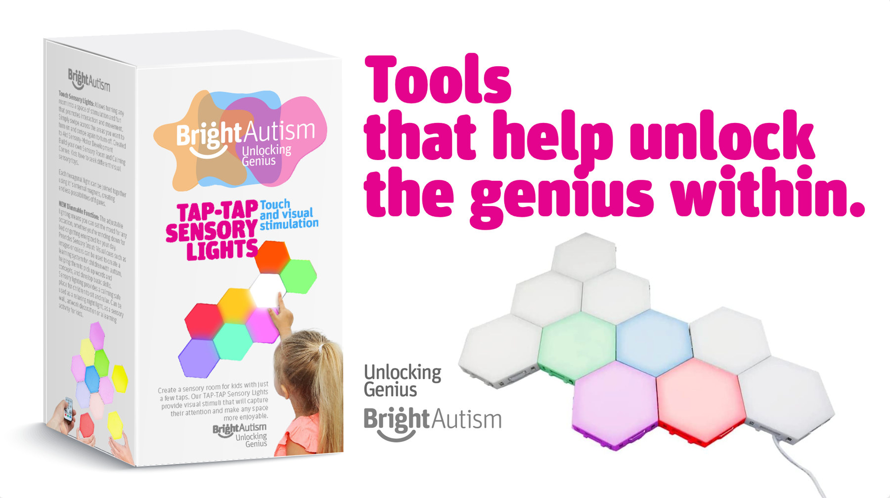
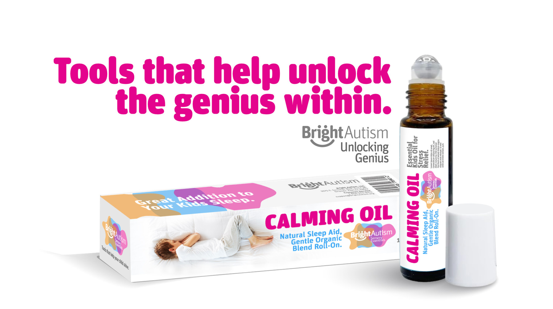
Each product carries the same line and the same promise, so a shelf of them reads as one system rather than a catalogue of interventions.

LITTLE ROCKING CHAIR
TAP-TAP SENSORY LIGHTS
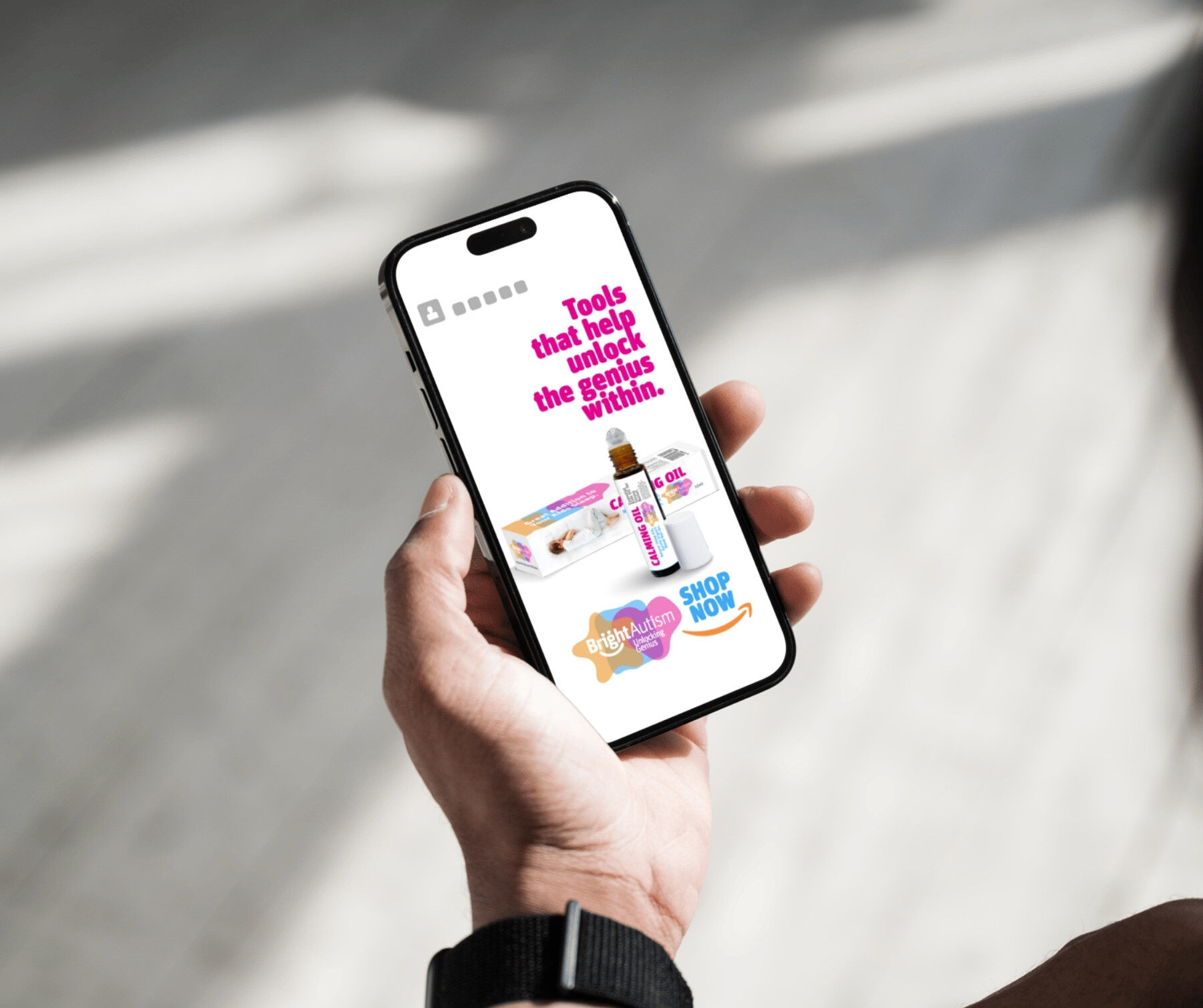
CALMING OIL
THE WEIGHTED BLANKET · DESIGNED FOR SENSORY NEEDS
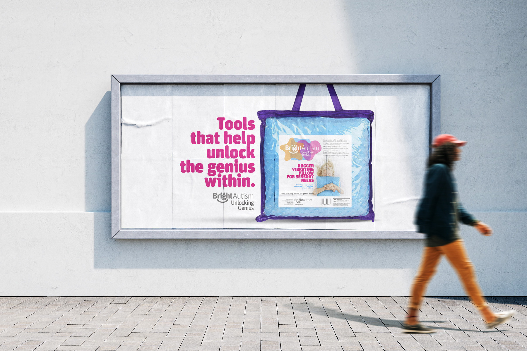
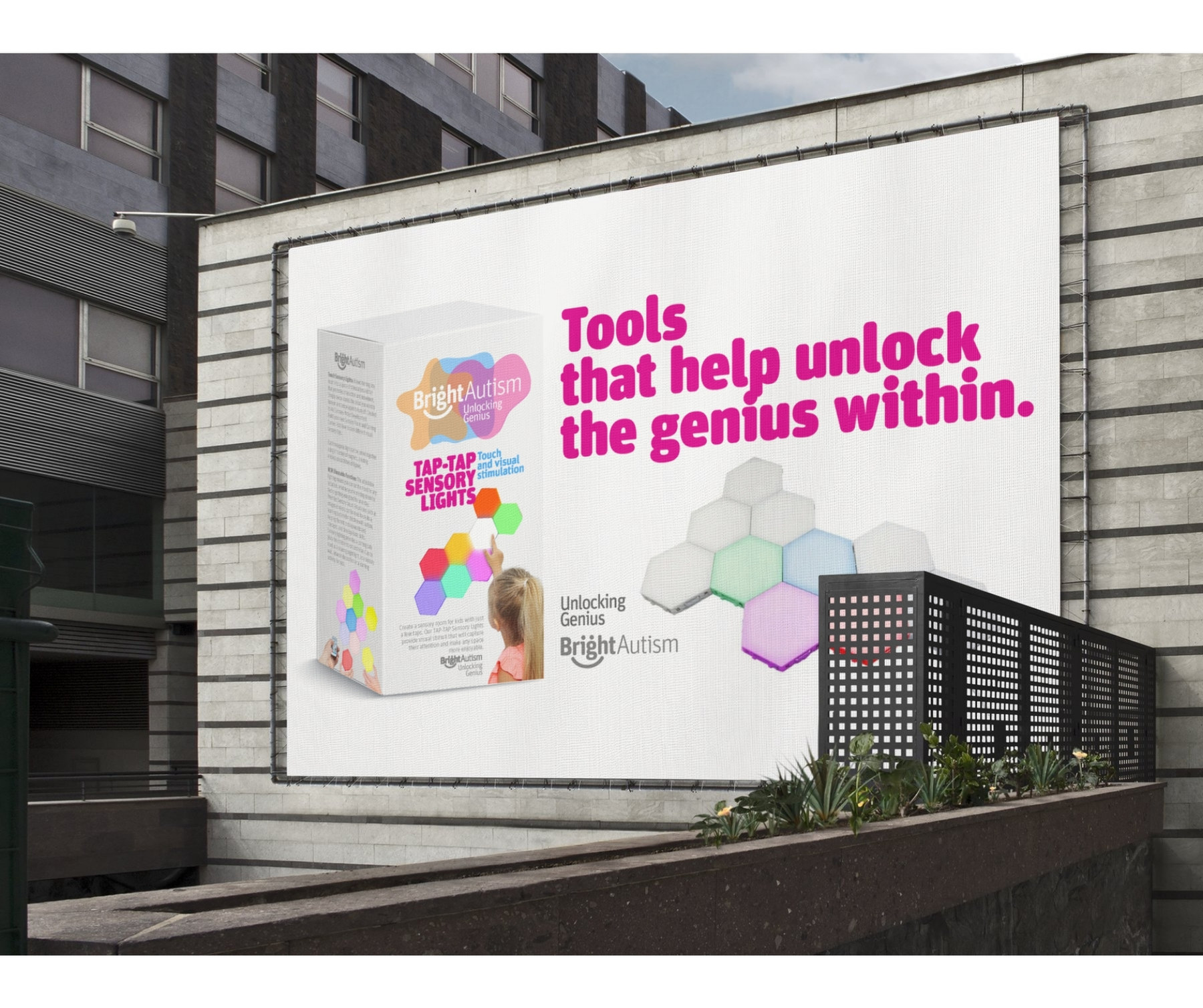
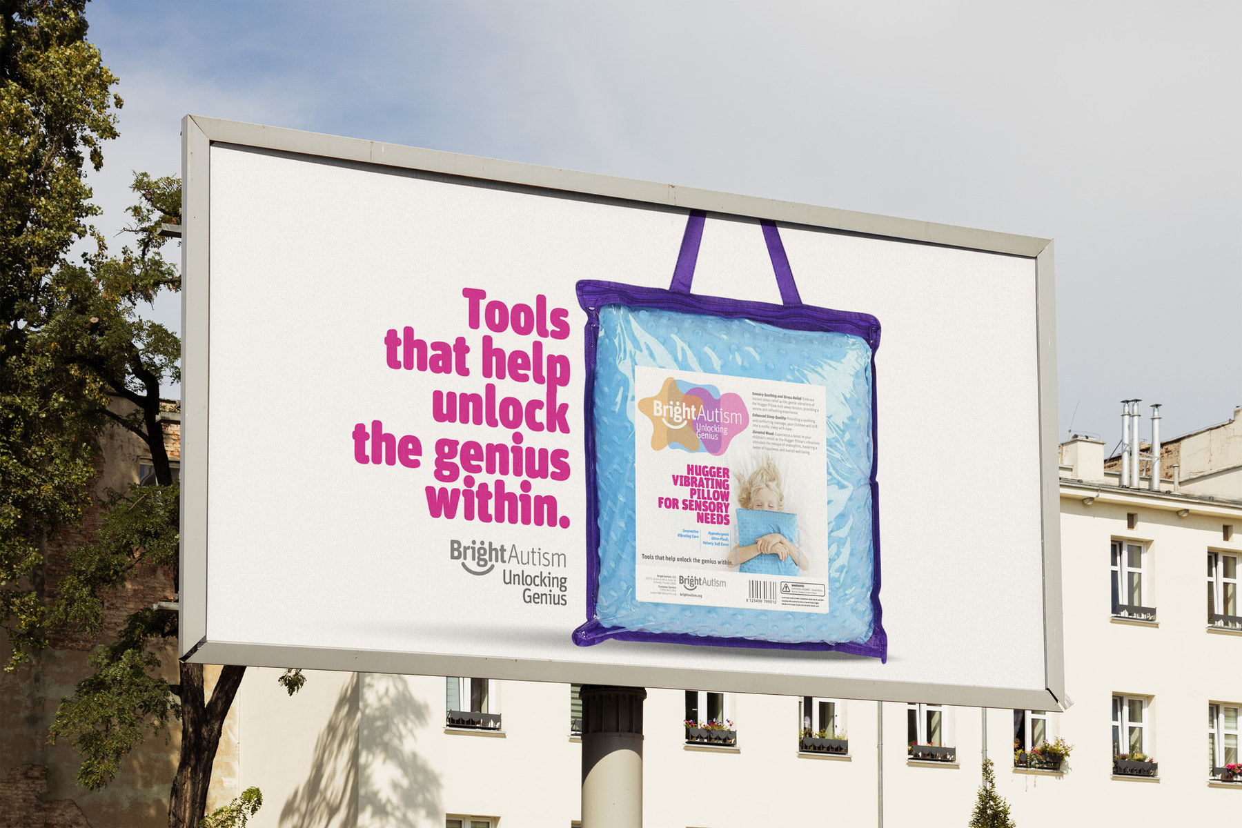
OUT OF HOME

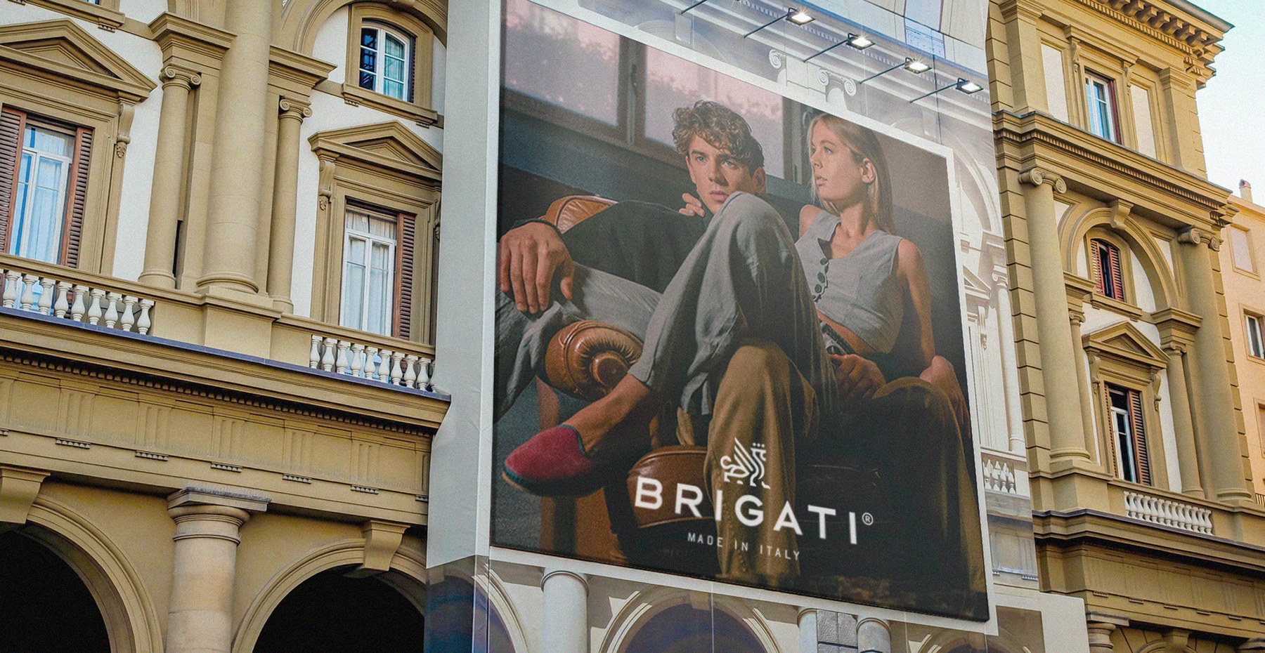
Said in public, where the stigma lives.

TOOLS THAT HELP UNLOCK THE GENIUS WITHIN
STREET LEVEL
THE PRODUCT, SHOWN WITHOUT APOLOGY
THE DIGITAL PRESENCE

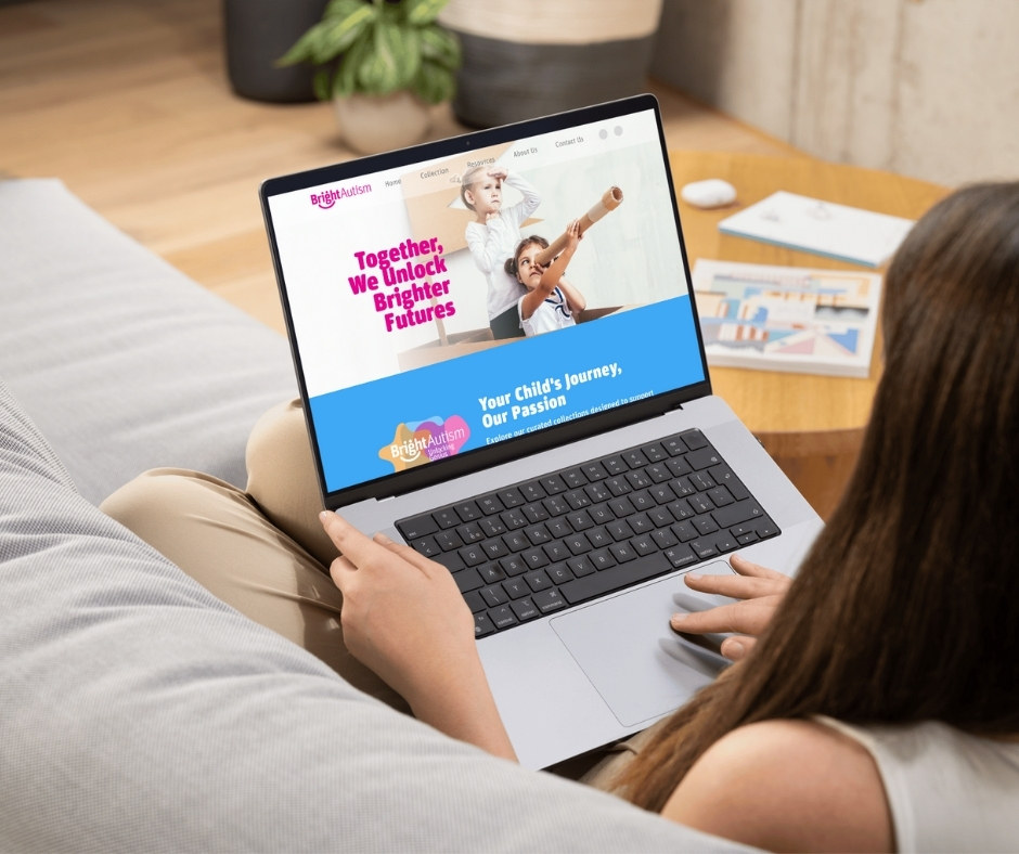
Together, we unlock brighter futures.

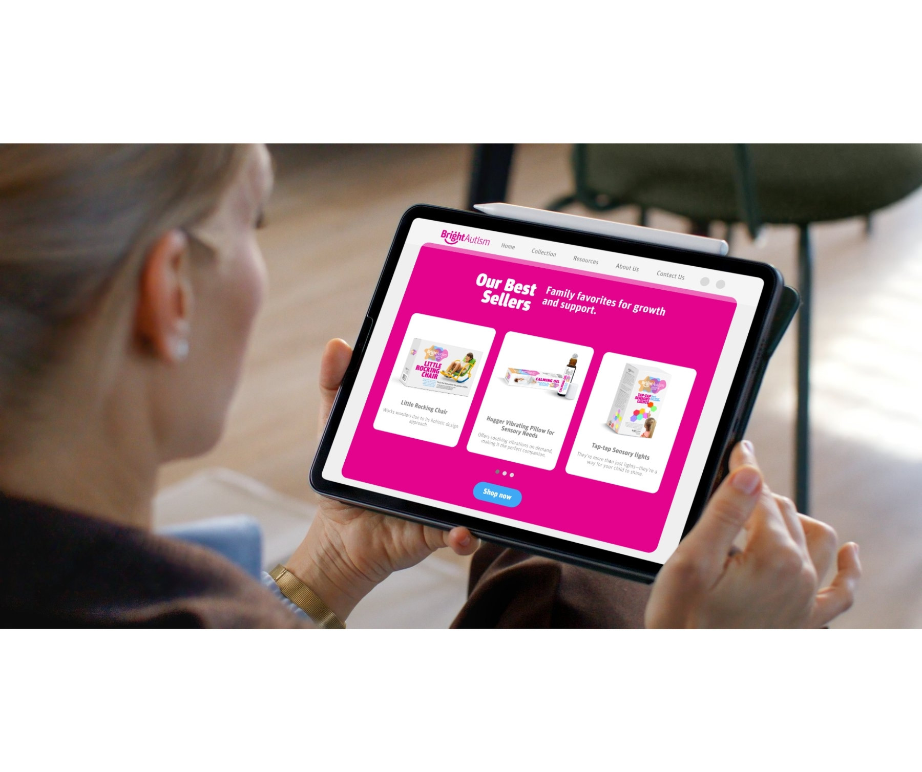
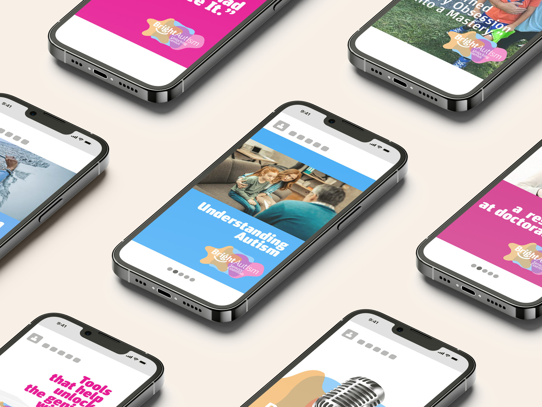
The site is built as a guide rather than a shop. A parent arrives mid-question, and the structure answers before it sells: your child's journey, the tools, the evidence, the community.

Sensory considerations carry into the interface itself. Contrast, motion and density were all tuned so the experience never becomes another thing to manage.

The Bright Autism website
BRIGHTAUTISM.COM · A GUIDE FIRST, A SHOP SECOND
IN THE HAND
THE EDUCATIONAL CONTENT
COMMERCE, KEPT GENTLE
THE SOCIAL CONTENT SYSTEM
THE FULL PAGE · STRUCTURE AS REASSURANCE
BEYOND THE PRODUCT

A podcast, because a brand that takes a position should be able to hold a conversation.

Concept, copy and content strategy for a podcast that turned the brand into a space for education, empathy and community, bringing expert guidance and real family experience into the same room.

Alongside it, an educational content framework and a full design system, so everything that comes next is built with the same care rather than improvised.

THE RESULT
It launched not as a product line, but as a movement.
A brand that reframes what it means to raise a child who sees the world differently, and one that families trust, return to and share with each other. By moving the focus to the parents who see beyond the diagnosis, we built something rooted in belonging, empowerment and discovery.
THE PROOF
1LINE THE WHOLE BRAND IS BUILT ON
0CLINICAL LANGUAGE, ANYWHERE IN THE SYSTEM
8DISCIPLINES, FROM NAMING TO PODCAST
2READERS AT ONCE: THE PARENT AND THE CHILD