WorkStudioLabPeopleInsights
Book a consultationLogin
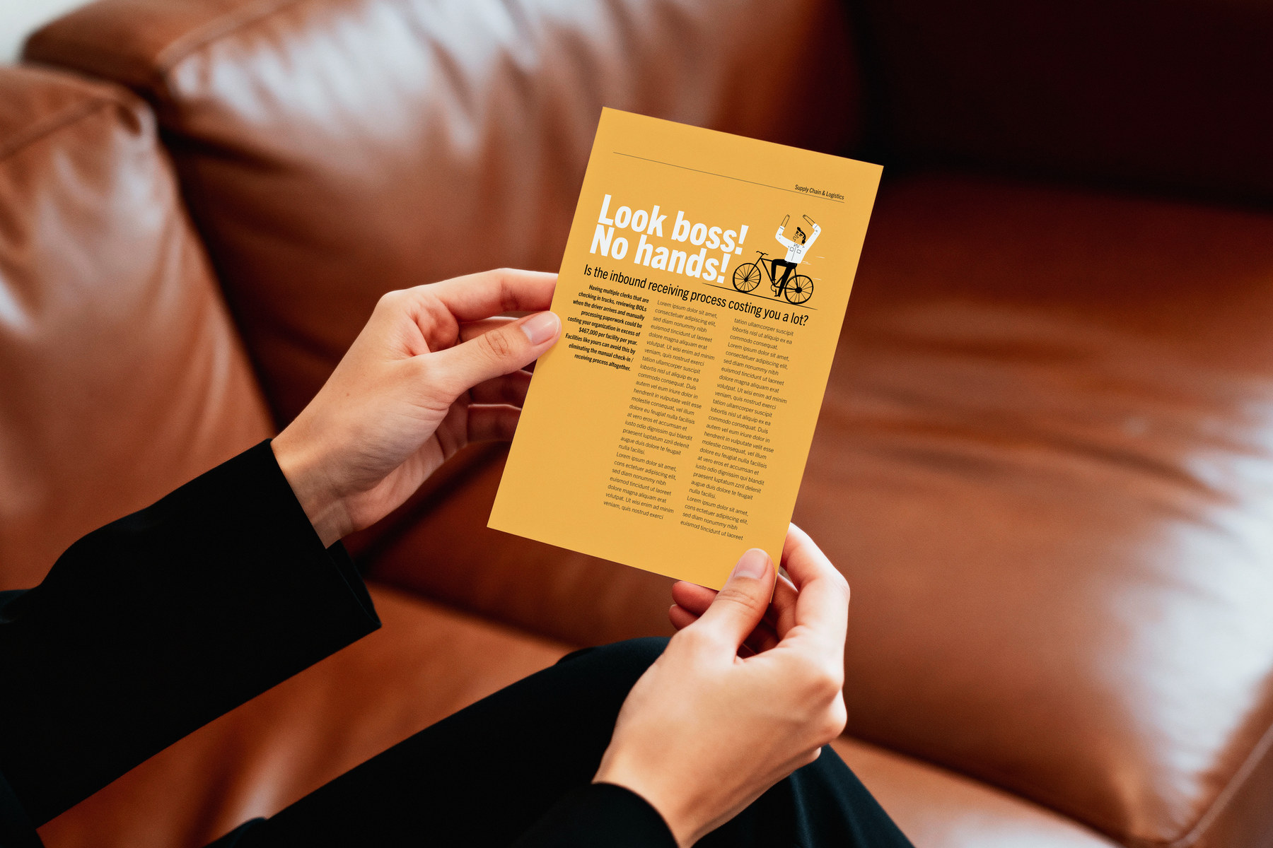
Hands holding the Look boss, no hands direct mail piece
← WORK·CHAIONE

ChaiOne

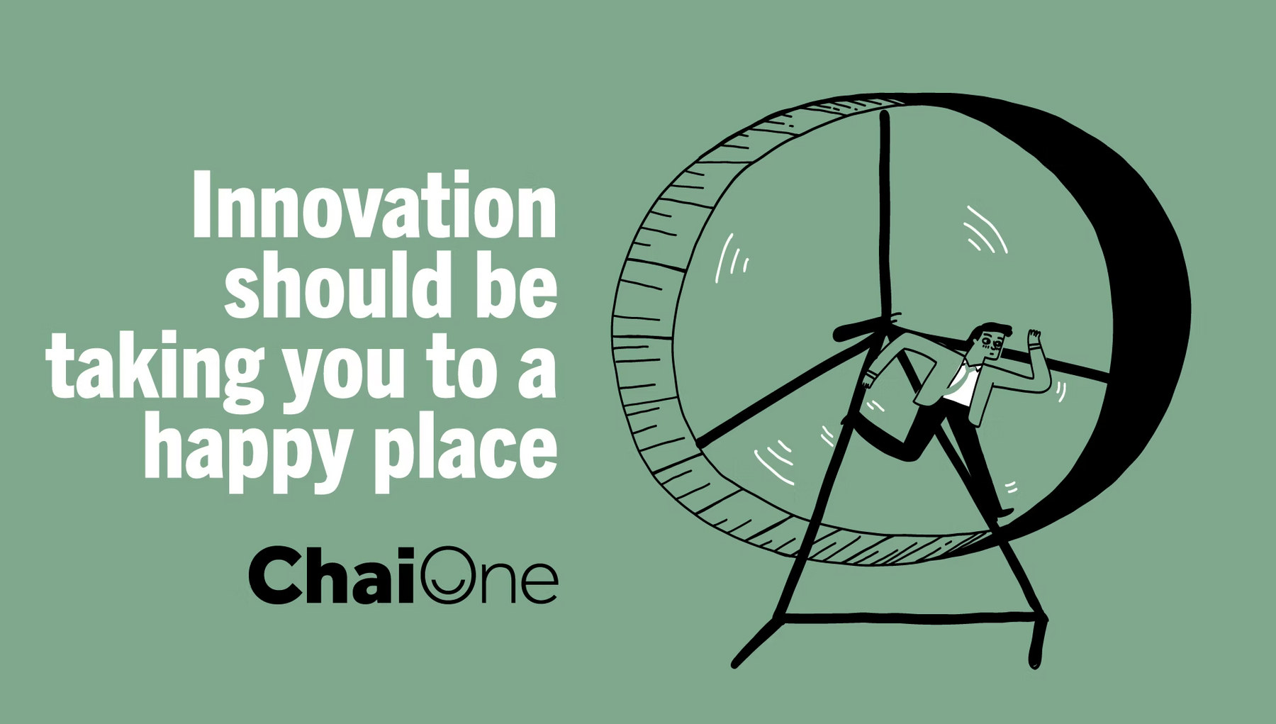
Innovation should be taking you to a happy place.
WHAT WE DID
Brand workshopPositioning strategyBlue ocean analysisBranding and identityLogo designPalette and illustration systemVoice and toneCreative directionWeb designCampaignOut of home
SECTOREnterprise software and digital transformation
DISCIPLINESPositioning · Identity · Logo · Creative direction · Web · Campaign
METHODBrand workshop · blue ocean strategy
THE PROBLEMA name that no longer explained itself
SCROLL
THE CONTEXT

ChaiOne is a software engineering firm that upskills employees and streamlines the processes a business runs on. Serious work, done well.

For anyone outside computing, the services were overwhelming. We were asked to align the mission and the brand so the company sounded like the people who actually work there.

ChaiOne key visual
THE PLATFORM LINE, AS IT RUNS TODAY
THE CHALLENGE

A name born in a room that had nothing to do with software.

Chai One came from an earlier venture. The founder was building a chai tea chain to rival Starbucks. The venture was abandoned, but the investors had seen his professionalism, enthusiasm and diligence, and backed him anyway. That is how ChaiOne exists.

A great origin story, and a brand that no longer resonated with the clients it was trying to win. Growth was being stunted by an identity that explained neither what the company did nor why anyone liked working with it.

THE WORKSHOP

We went looking for the culture before we went looking for a logo.

Rather than start with the market, we started with the executive team and the staff: values, identity, and how the place actually feels to work in.

What we found was a genuinely thriving culture. A motivated, bonded, professional team who held Chai meetings, sat down together over tea and talked about the company as a group. The warmth was already there. It had simply never been allowed into the brand.

THE INSIGHT
The company was easy to like and impossible to understand.
Complexity was doing the talking. Once the human side was given the front position, the technical capability stopped being a barrier and became the reassurance underneath it. Clear communication is not decoration in enterprise software. It is the entire condition of being considered.
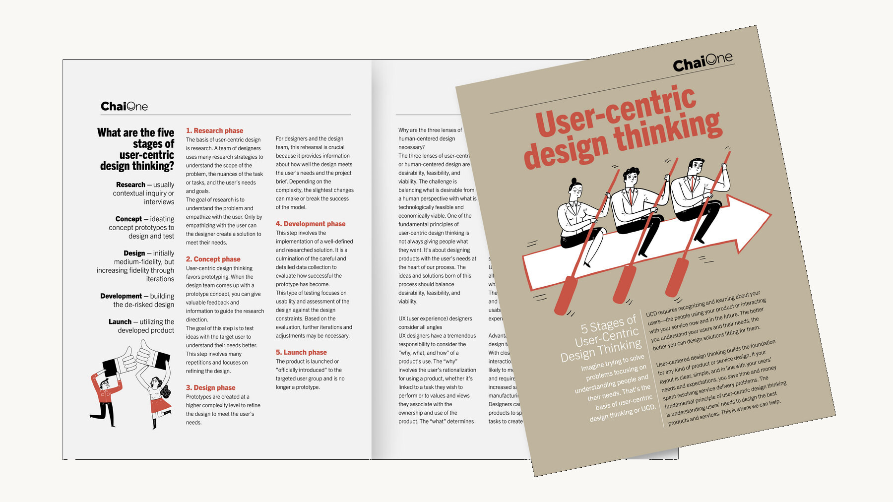
User-centric design thinking, the printed brochure spread
USER-CENTRIC DESIGN THINKING · THE PRINTED ARGUMENT
THE STRATEGY

A blue ocean argument, and a smile inside the O.

Our strategists built the blue ocean case, and the creative team took it into the logo, the site and the story. The old mark was the company name with a chai leaf. The new one puts a smiling face in the O of ChaiOne.

It carries three things at once: the work culture, the tea tradition the team already had, and the personal way this company handles a digital transition. The palette moved to nature-based, agreeable colours, and the writing was rebuilt to sound conversational rather than robotic.
THE CAMPAIGN

Questions a client is already asking themselves, asked out loud.

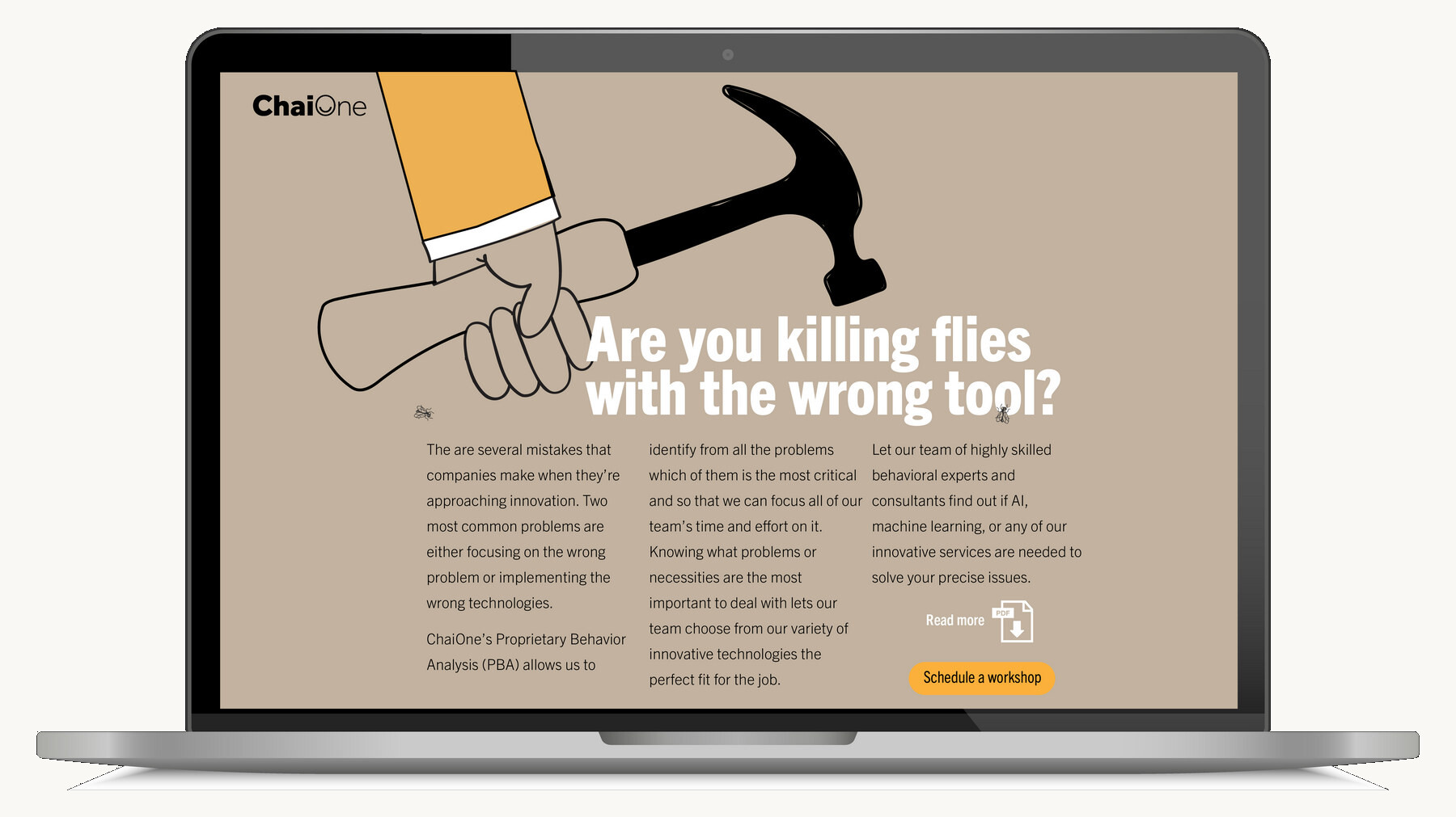
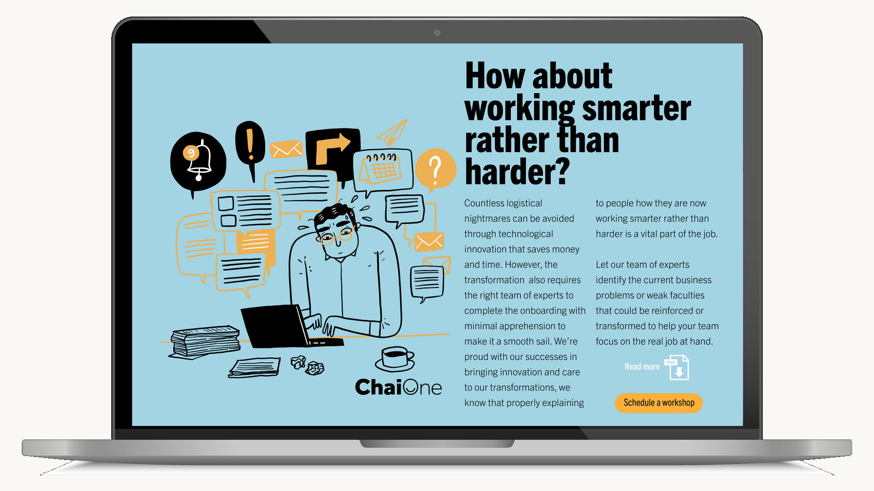
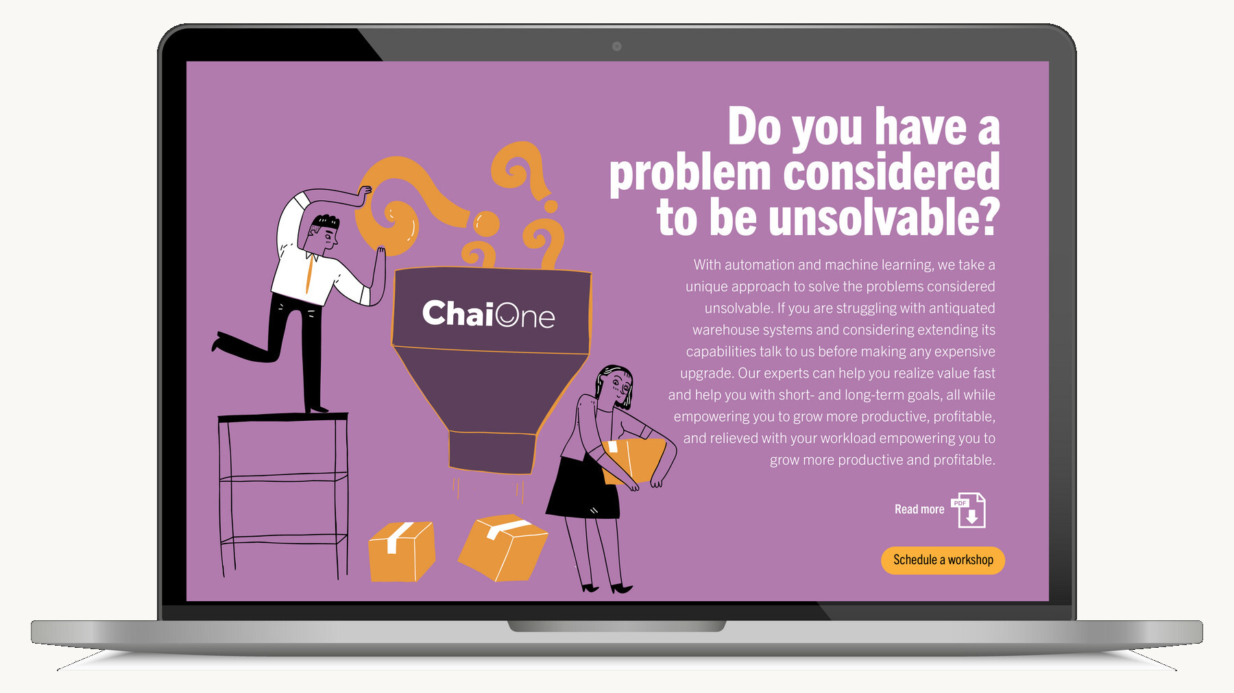
Rather than describing methodology, the campaign opens with the frustration. Are you killing flies with the wrong tool. How about working smarter rather than harder. Do you have a problem considered to be unsolvable. Each one leads to the same place: innovation should be taking you somewhere better.

ARE YOU KILLING FLIES WITH THE WRONG TOOL?
HOW ABOUT WORKING SMARTER RATHER THAN HARDER?
DO YOU HAVE A PROBLEM CONSIDERED TO BE UNSOLVABLE?
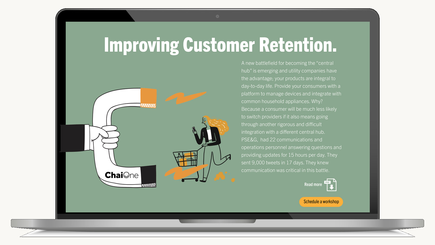
IMPROVING CUSTOMER RETENTION
INNOVATION SHOULD BE TAKING YOU TO A HAPPY PLACE · THE LINE THAT HOLDS THEM ALL
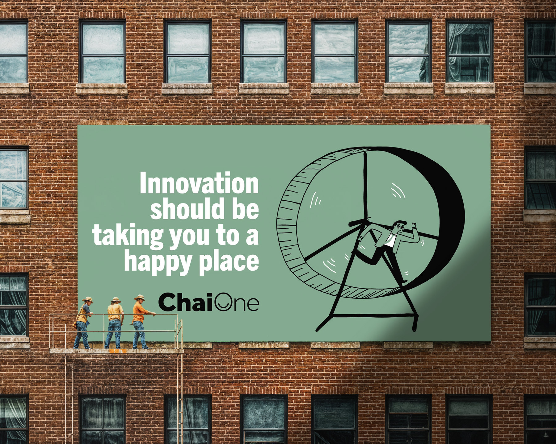
ChaiOne urban billboard
OUT OF HOME · AN ENTERPRISE SOFTWARE FIRM, SAYING SOMETHING HUMAN AT CITY SCALE
THE SYSTEM IN USE

Illustration doing the work jargon used to do.

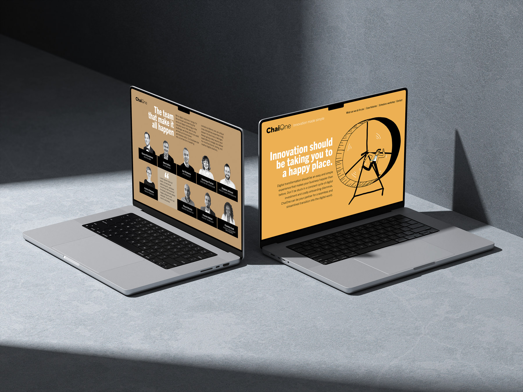
A drawn world, warm and plain, that lets a complicated service be explained in one frame. It runs from the site to the social feed to the printed thinking pieces without changing register.

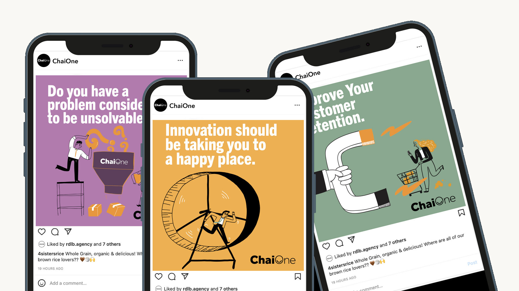
SOCIAL · THE SAME VOICE, SHORTER
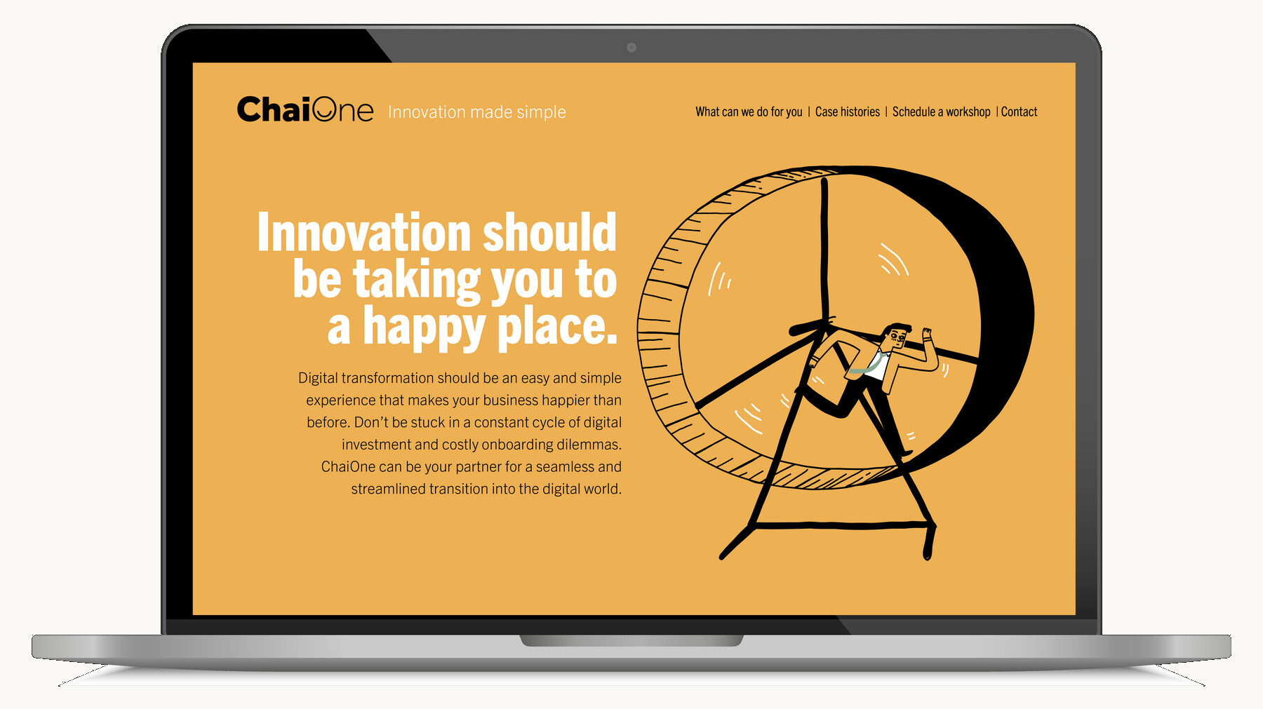
THE SITE · CONVERSATIONAL, NOT ROBOTIC
THE RESULT
Simplify the complexity, and the human part is what people remember.
By making the brand approachable and putting the culture in front, ChaiOne connected with clients it had been losing to its own vocabulary, and grew accordingly. Making complicated simple. It is the hardest thing to do well, and it is the whole job.
THE PROOF
1LETTER CHANGED · A SMILE INSIDE THE O
ChaiTHE MEETING THE COMPANY ALREADY HELD, MADE THE BRAND
0JARGON LEFT IN THE STORY
4CAMPAIGN QUESTIONS, ONE ANSWER