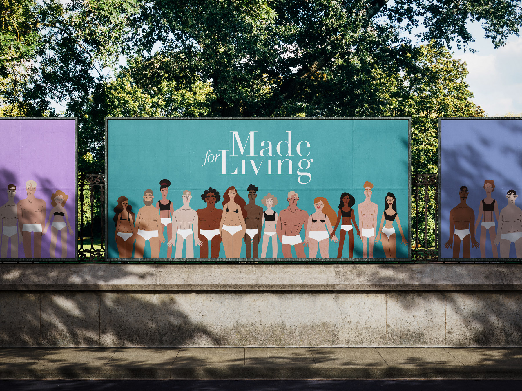
Made for Living
It's another underwear choice. Just with special protection.
WHAT WE DID
Competitive auditPositioningBrand platformNaming architectureIdentityPackaging systemWebsiteCampaignSocialOut of homePrint
SCROLL
A new brand entering adult incontinence. A category of fifty million American users, near identical products, and not one brand willing to be seen.
We were asked for packaging. We started with the reason nobody buys it in daylight.
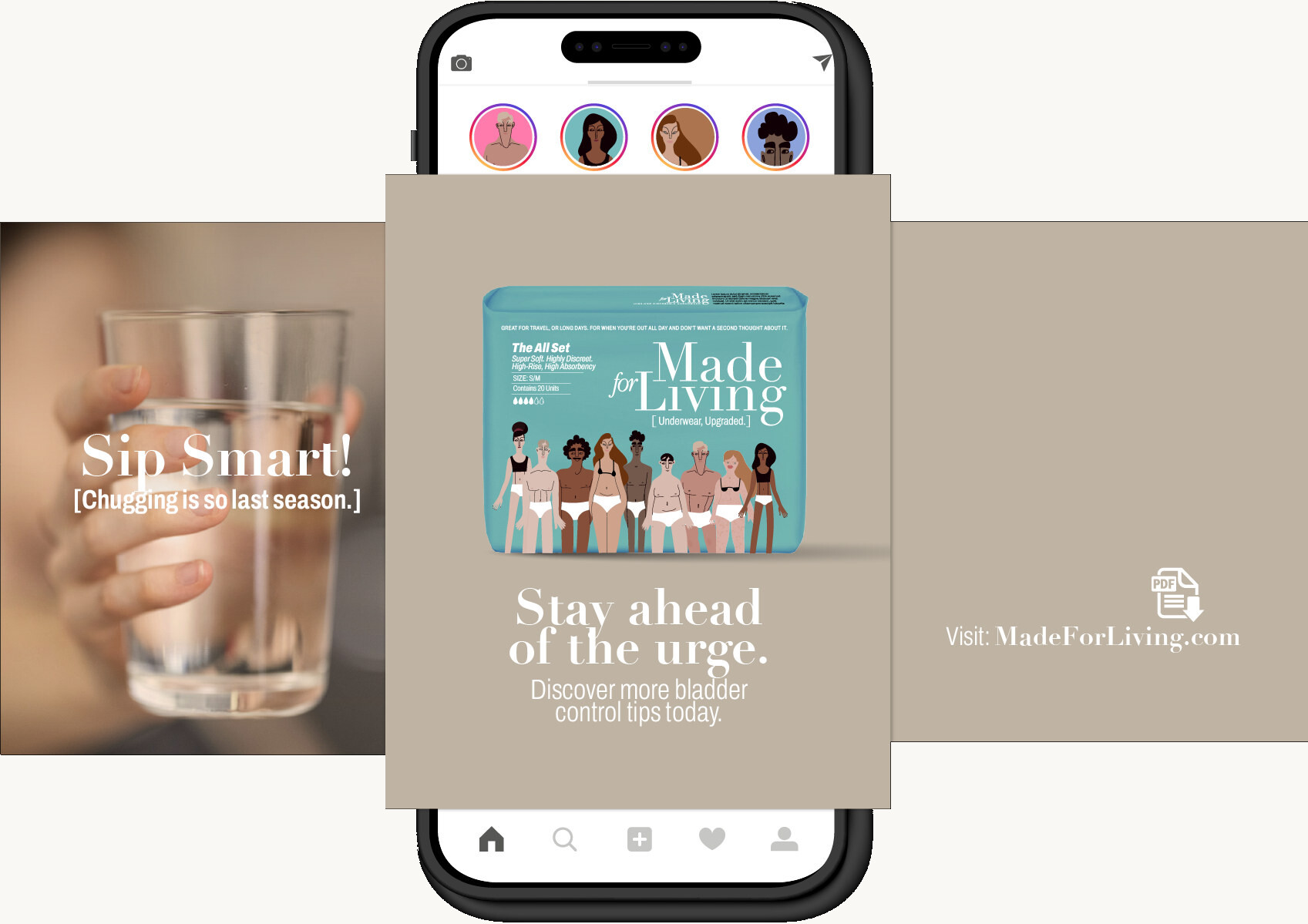
Absorbency is a solved problem. Every brand in the set performs, and every brand says so in the same words. A new entrant cannot win on the product, and cannot outspend Kimberly-Clark or Essity on the shelf.
So we audited seven competitors end to end. Pack, site, social, retail, search. What came back was not seven positions. It was one position, held seven ways, and an axis with nobody standing on the other end of it.
The discretion is not protecting her. It is confirming her fear.
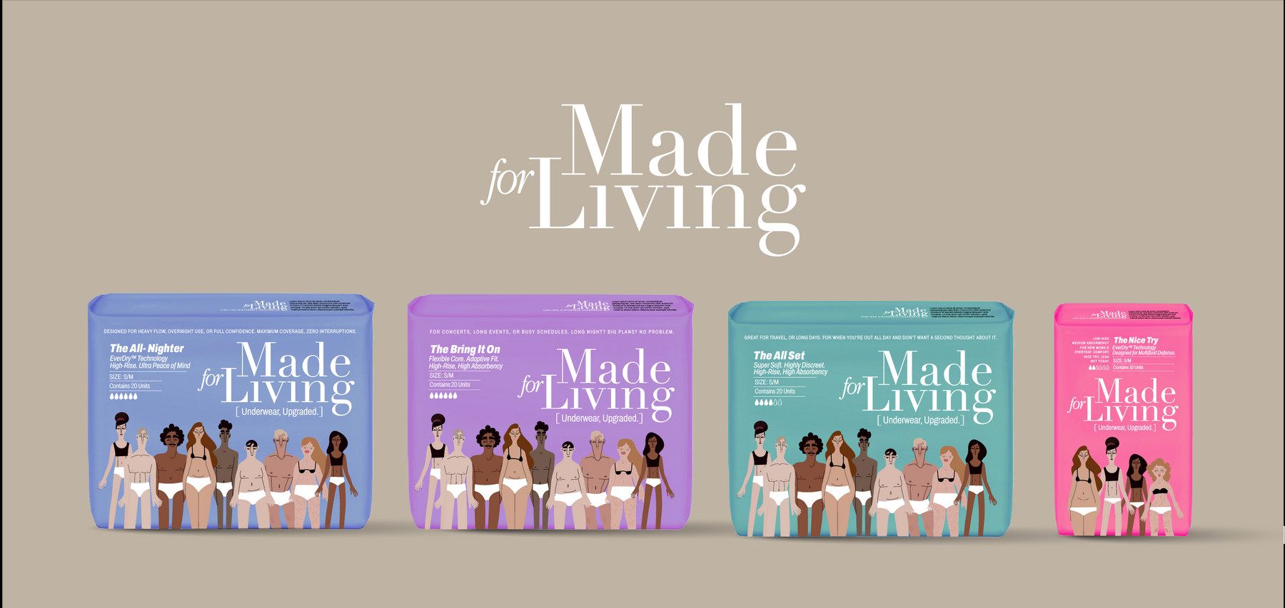
A blank bag does not build trust, does not carry a benefit, and does not make anyone proud of the choice they just made. Premium brands do not hide their product. The pack is the last piece of communication before the decision, and this category throws it away.
We put the question to the client as a fork, because you cannot design for one answer while pricing for the other. They chose premium. Which meant the brand could no longer behave like a medical supplier, because premium in a category built on hiding has only one available meaning.
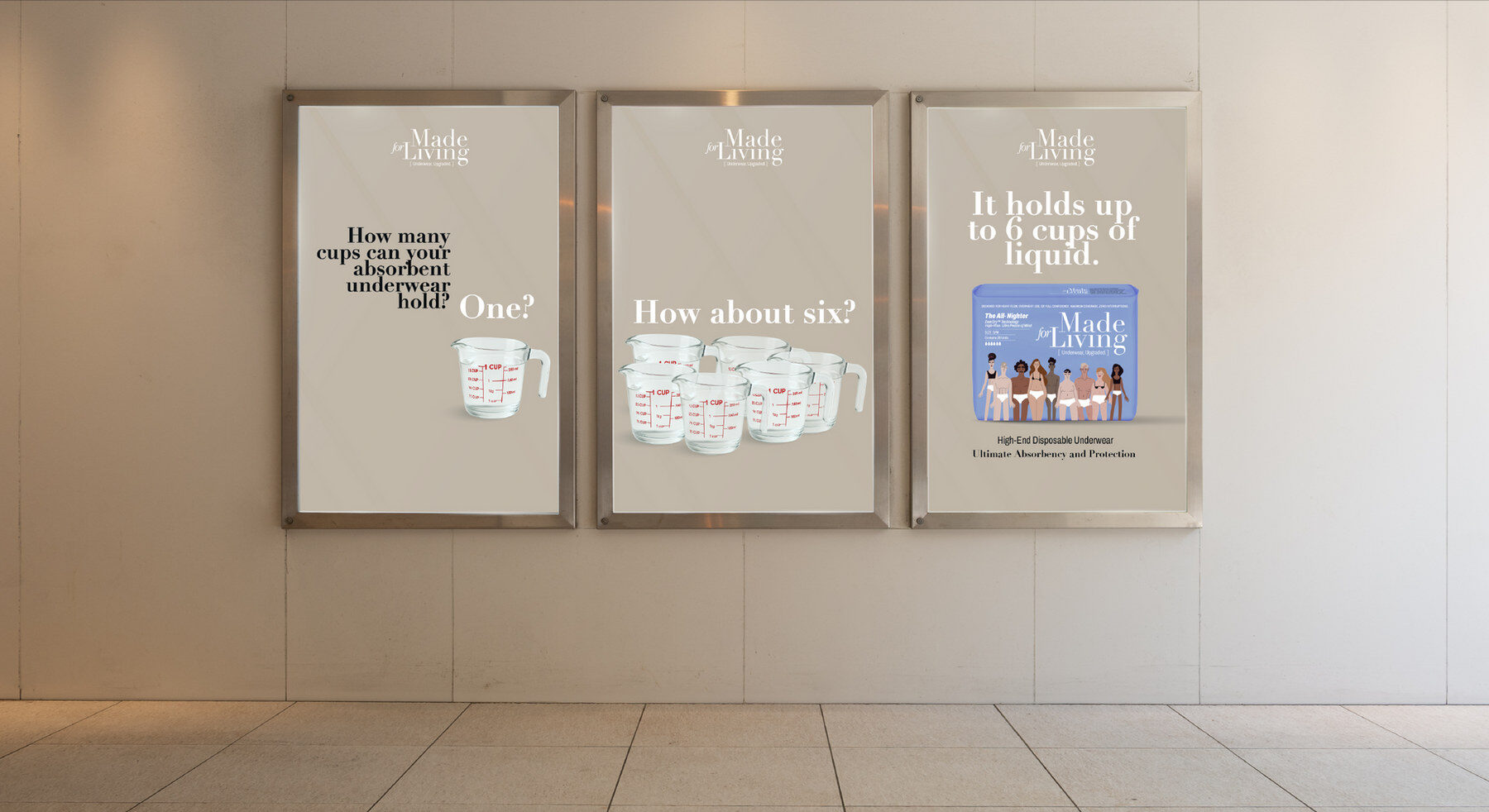
Incontinence is not only elderly, not only post operative, not merely natural. It is human, and roughly one adult in six lives with it. That reframe moves the brand off the medical axis entirely, onto one nobody was standing on.
Position the pack as a luxury in this category, and instil confidence rather than managing the wearer.
Premium absorbency and fit, understood as a better garment. The product is superior and is allowed to say so plainly.
A community that is not ashamed of needing leak protection. Unashamed, unafraid, willing to be seen.
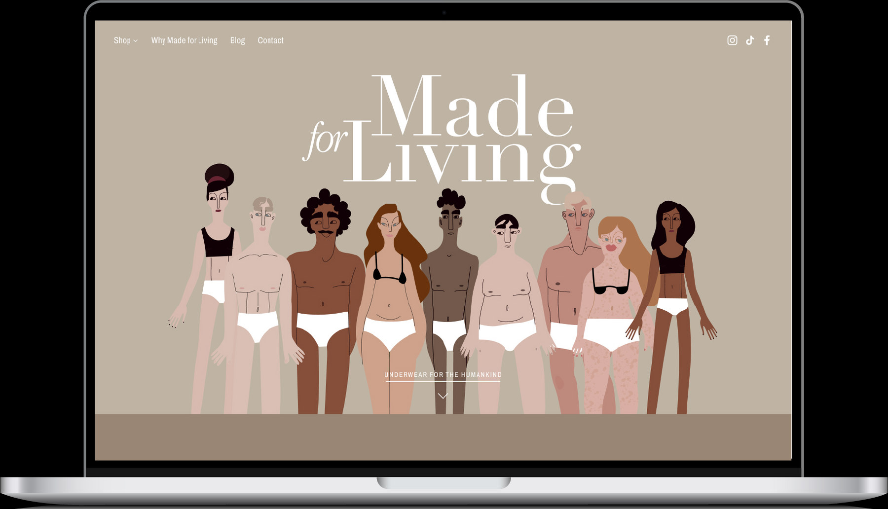
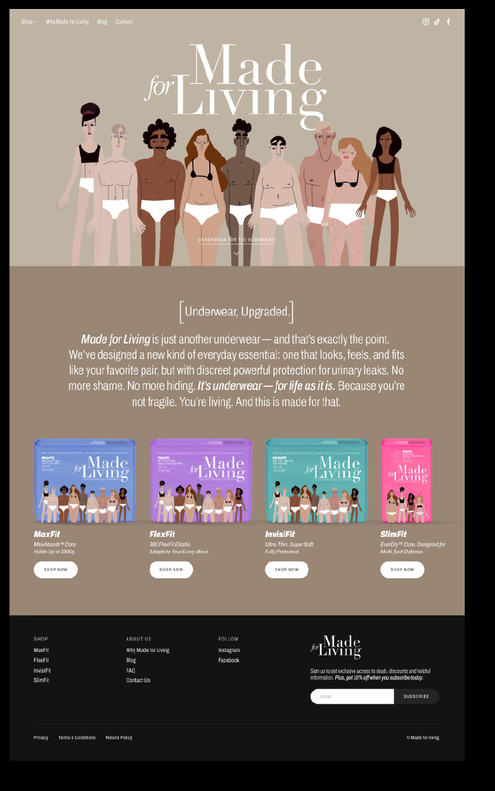
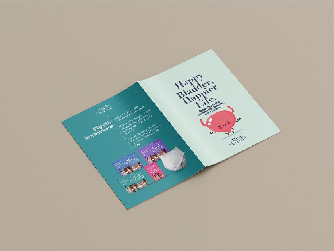
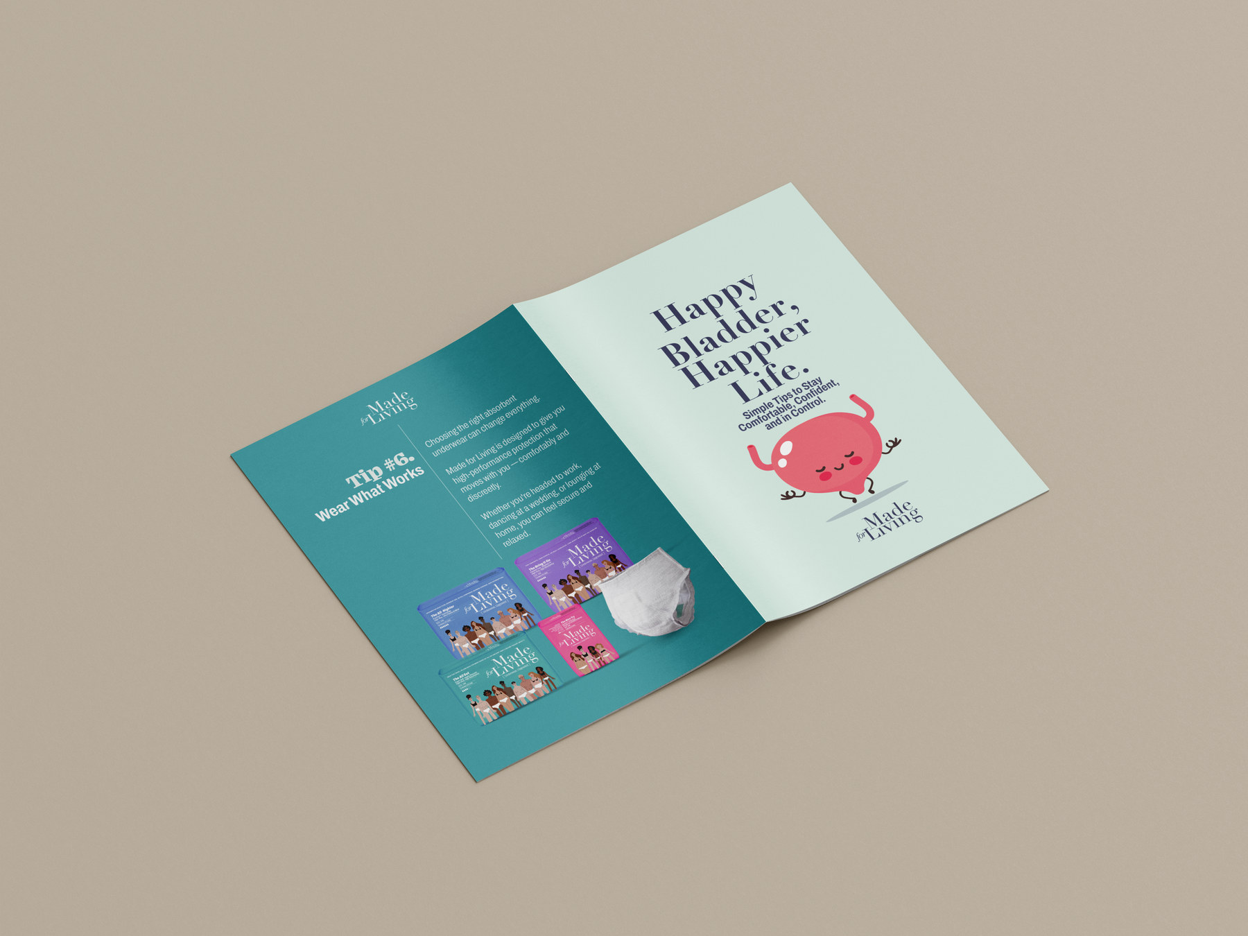
The old site read like a life insurance company: stock reassurance, muted palette, the product kept just out of frame. We rebuilt it as an apparel brand. Packaging carries the wearer, names the benefit, and holds a colour system that lets a shopper find her absorbency in a single pass.
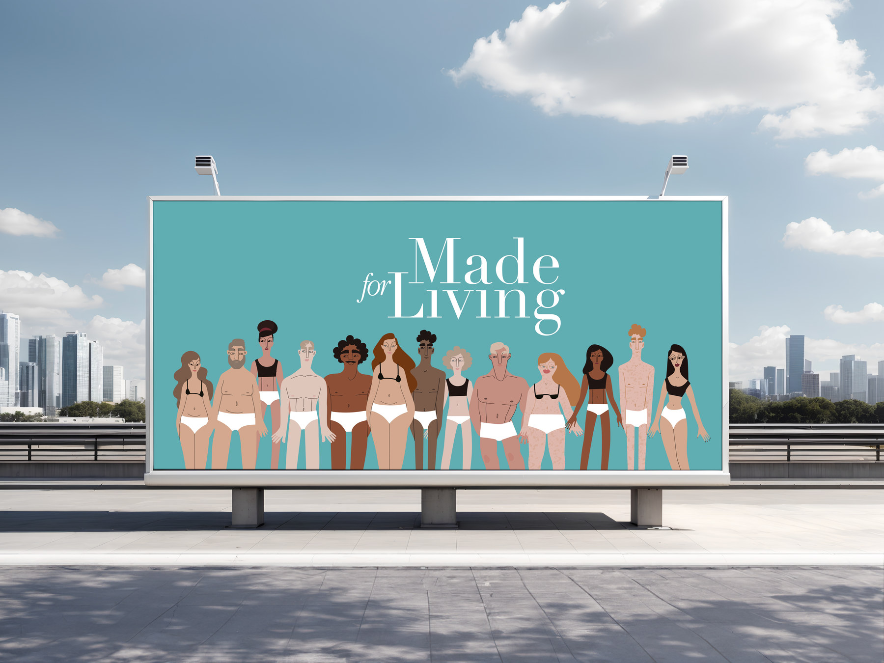
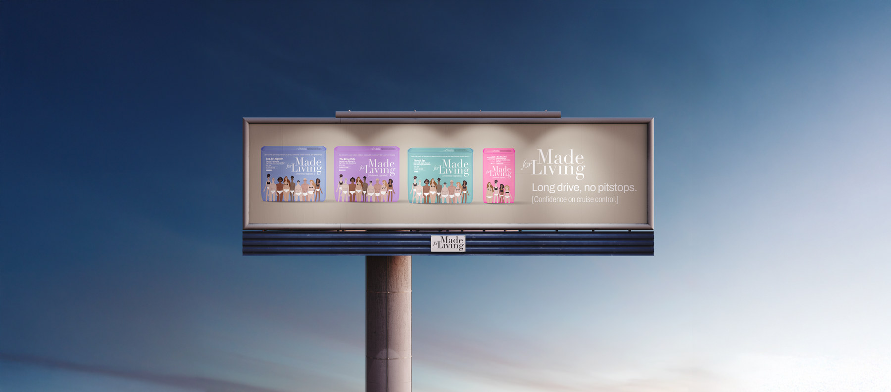
Shame does not survive being said out loud in good company.
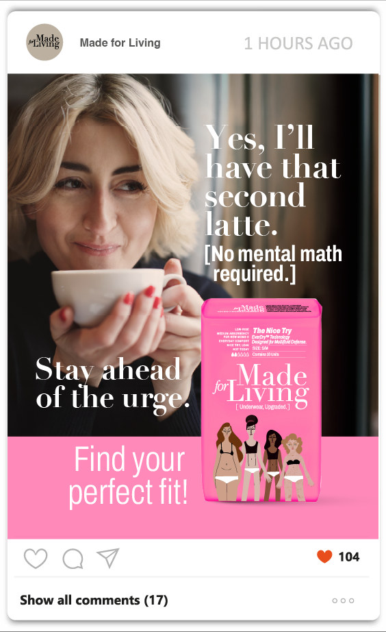
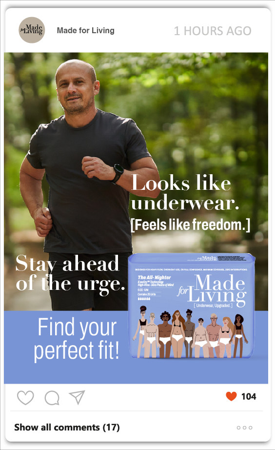
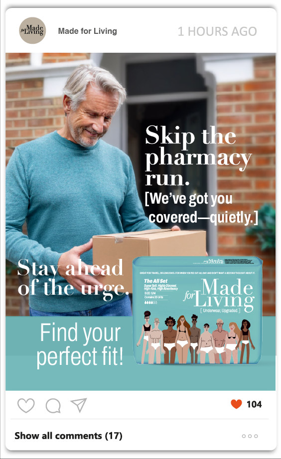
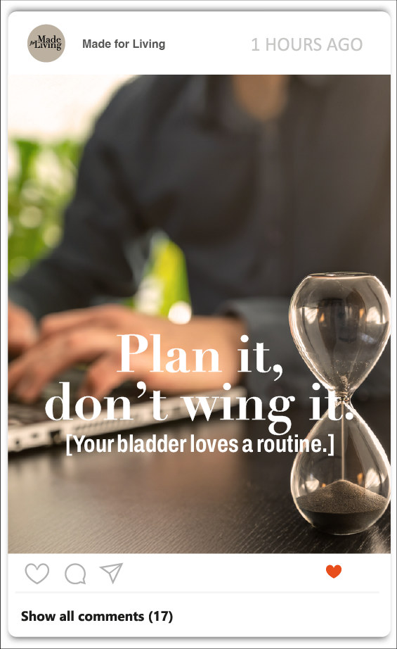
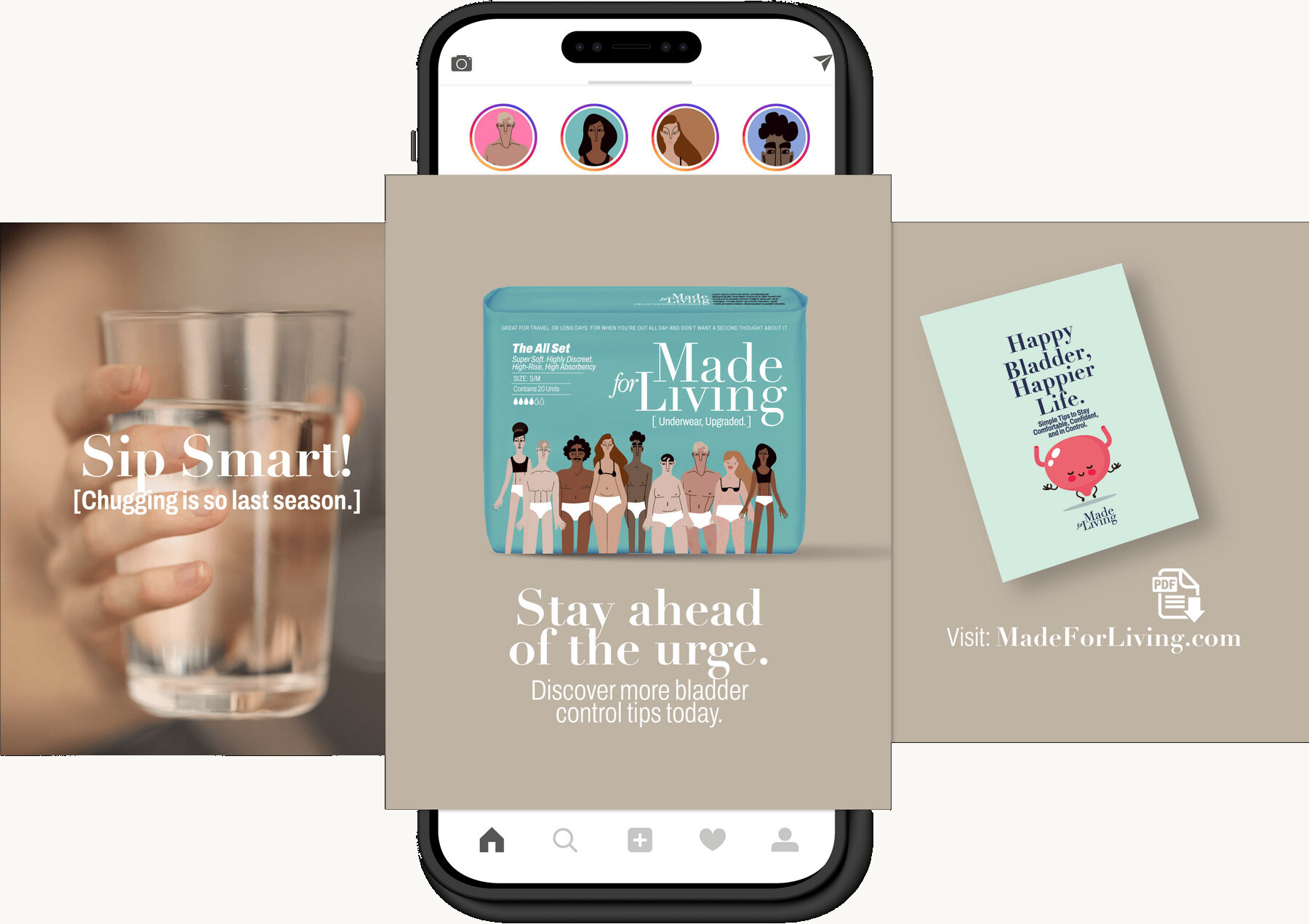
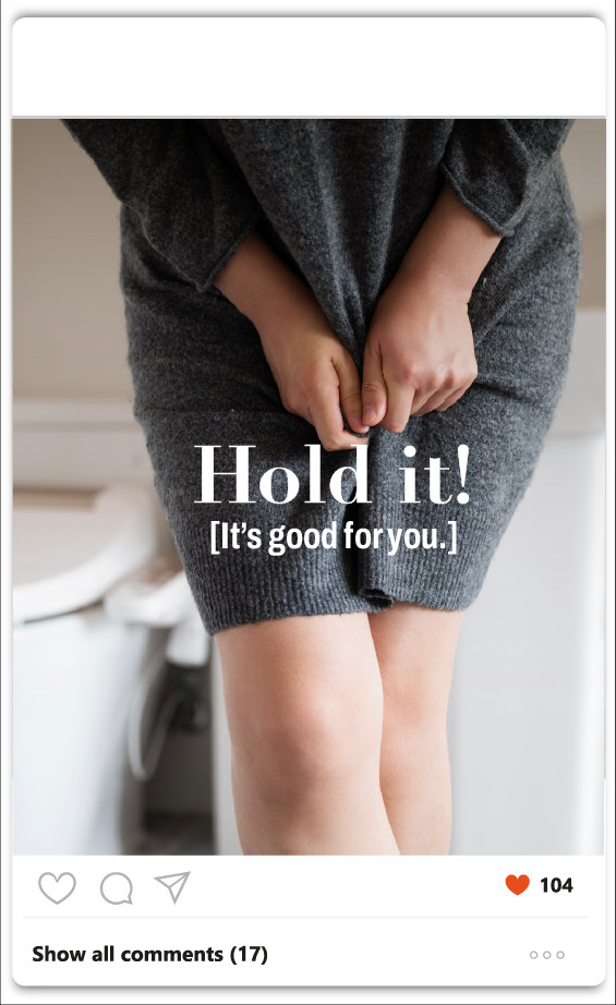
TENA had already proven in Australia that the confident message outperforms the discreet one. And within a month of the workshop, Poise began rolling out a campaign built on the same read.
Which told us two things at once: the position was right, and the window on it was closing. Platform, identity, pack system and site were delivered against that clock.