Neighbors
Bake your dreams.
WHAT WE DID
Brand strategyJust cause definitionVisual identityLogo designMessaging architecturePackagingCampaign creativeSocial creativeExperiential strategyContent and copywritingOrdering platform design
SCROLL
Meryl Kennedy, a longstanding client, acquired a storied cookie dough factory with a specific vision: an avenue for kids to build entrepreneurial skills and fund things their communities need.
The factory came with a product and a customer list. It did not come with the reason any of it mattered.
When we started, the brand talked about product. The kids being impacted and transformed by the opportunity, the entire point of the acquisition, were nowhere in the story.
It also carried none of the Kennedy family's own values. Love, compassion and community care, all of it inherited from Meryl's grandfather, a southern pastor who called every single person he met neighb.
He called everyone neighb.
Not the buyer, not the school, not the factory. The child. The goal we wrote is to empower children to reach the American dream by participating in their communities and learning entrepreneurial skills young.
That single decision reorders everything downstream. A fundraising company sells cases of product. A platform for young entrepreneurs sells a first experience of running something, and the product is how it gets funded.
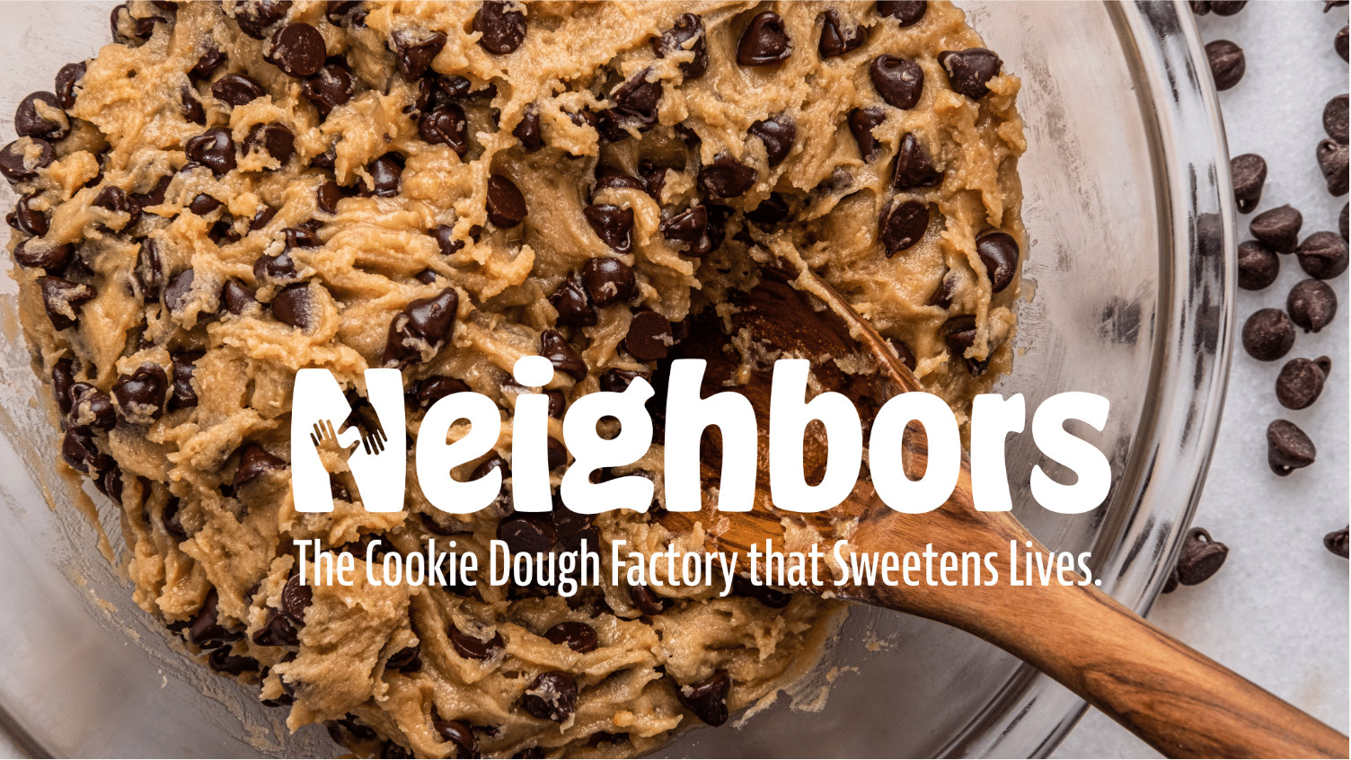
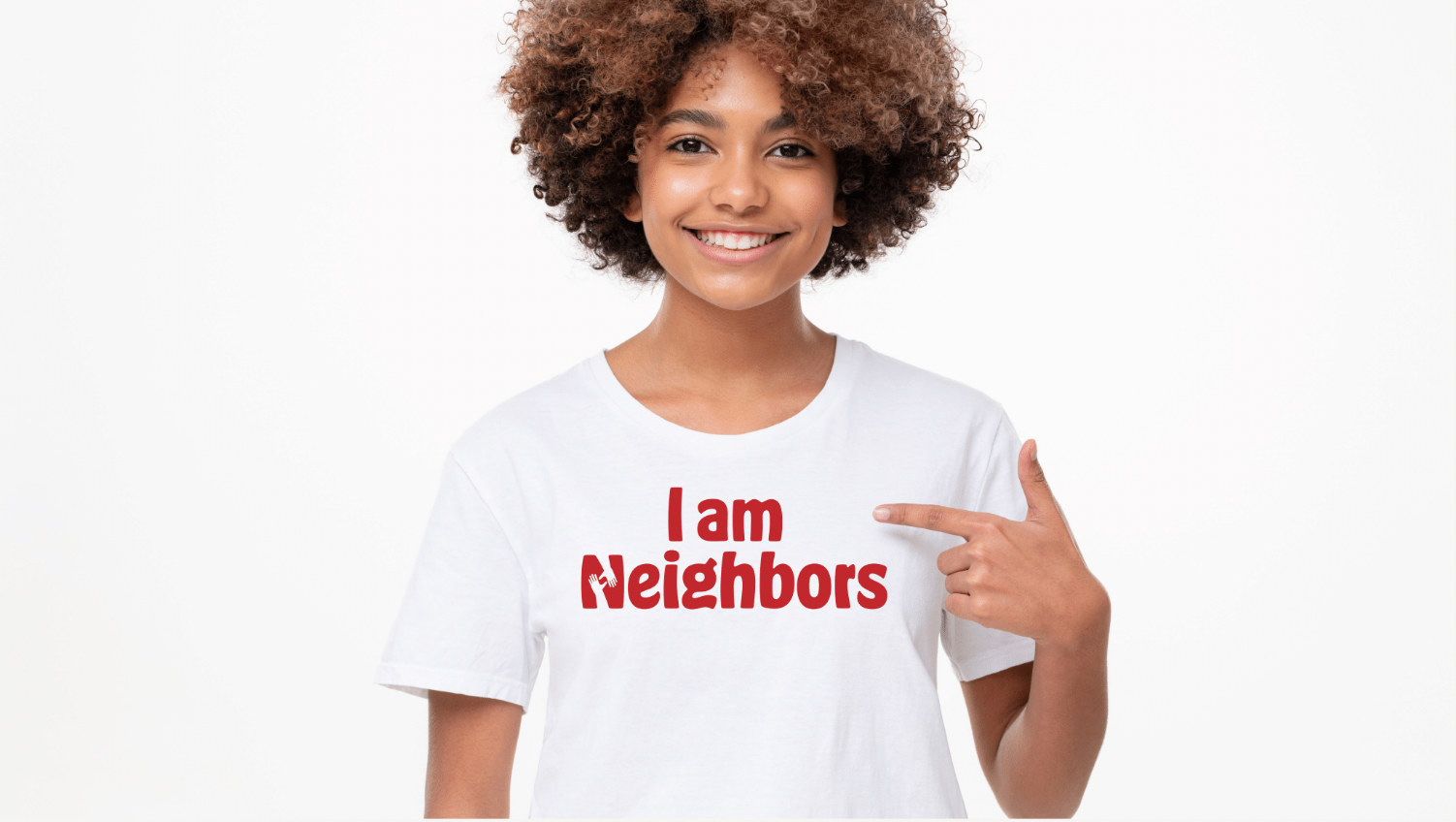
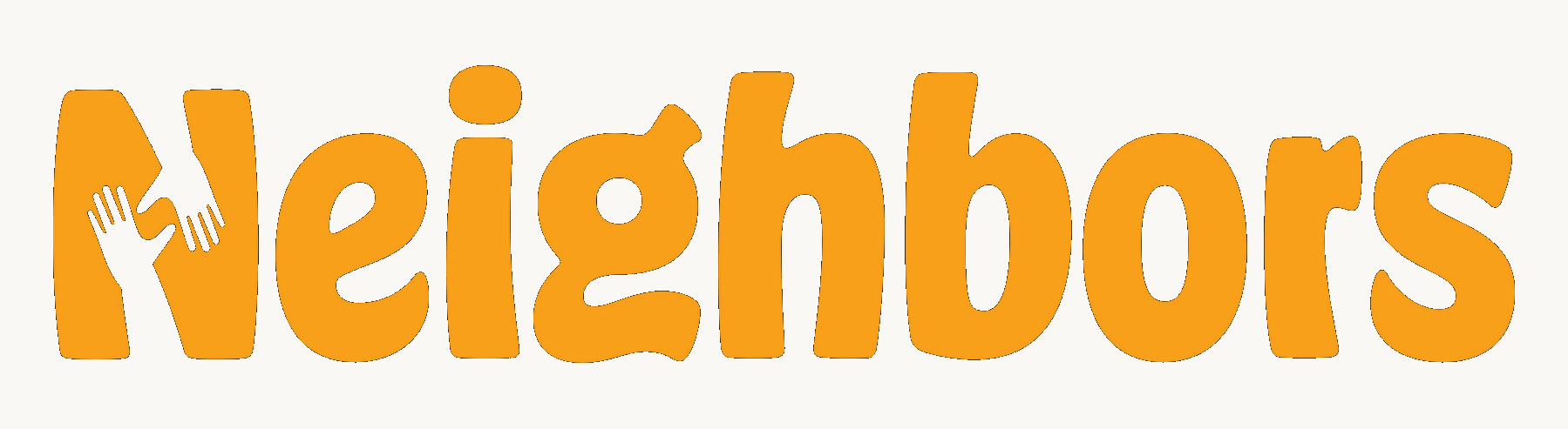
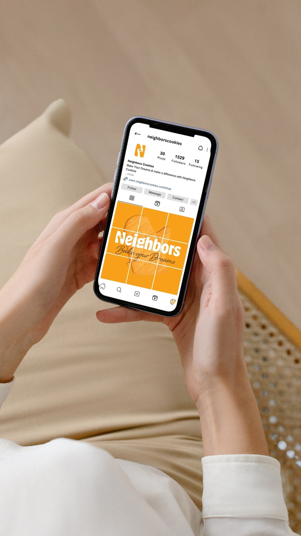
The old logo was dark red type and a smiling cookie: a product mark for a product business. The new one is two light orange hands coming together into the letter N. Support, made structural rather than stated.
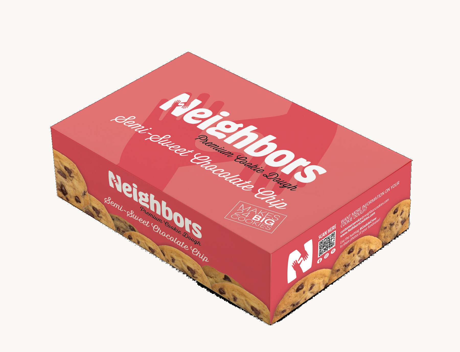
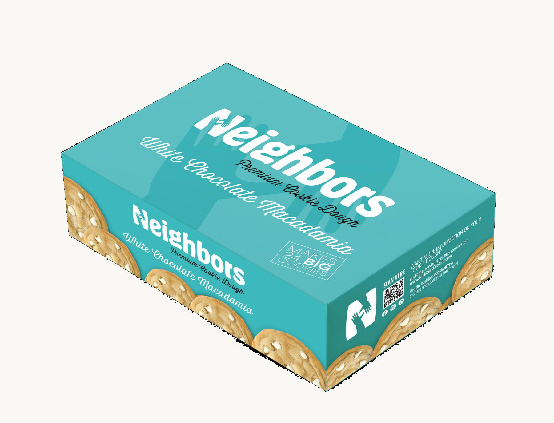
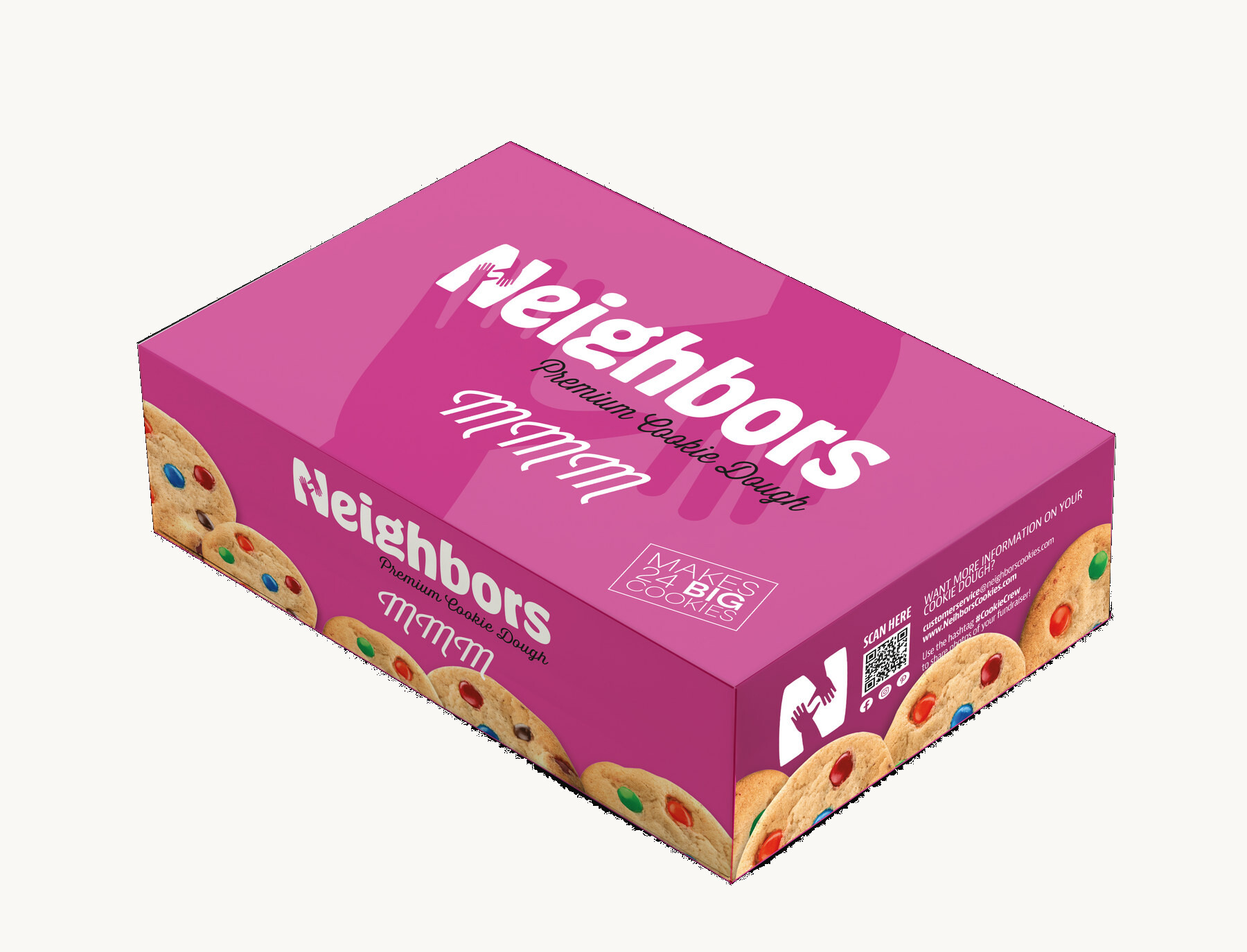

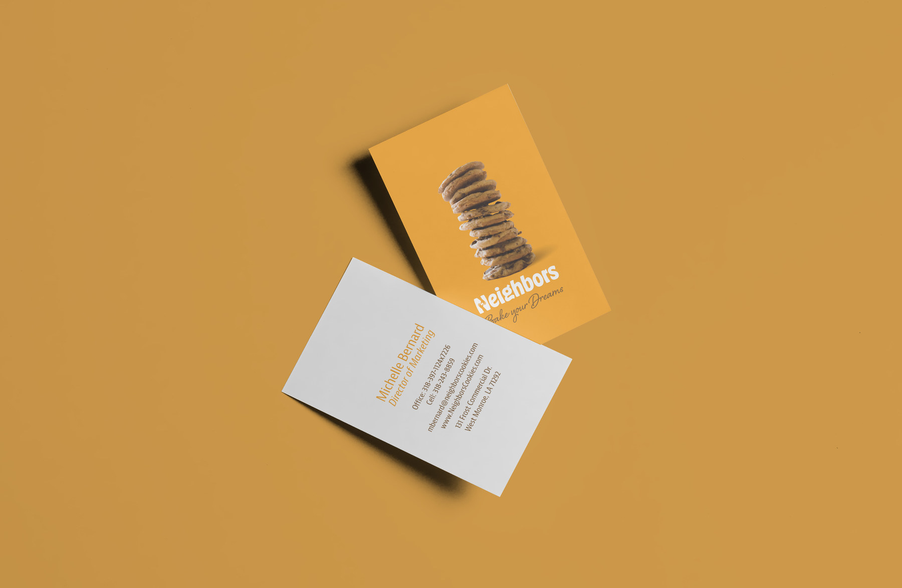
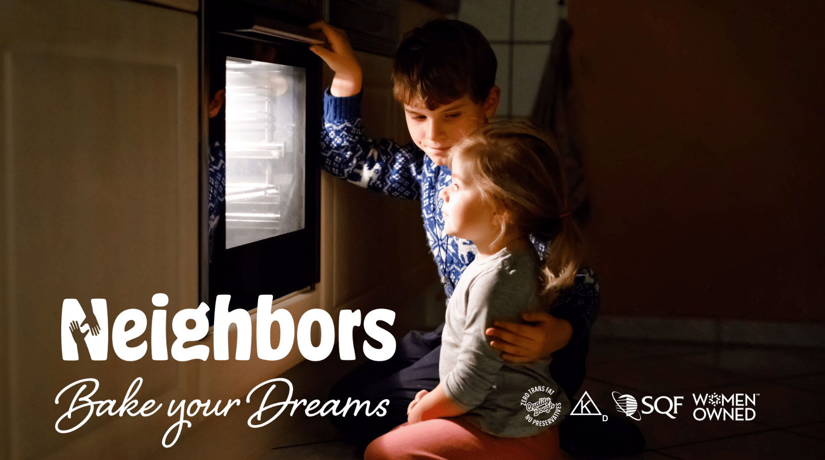
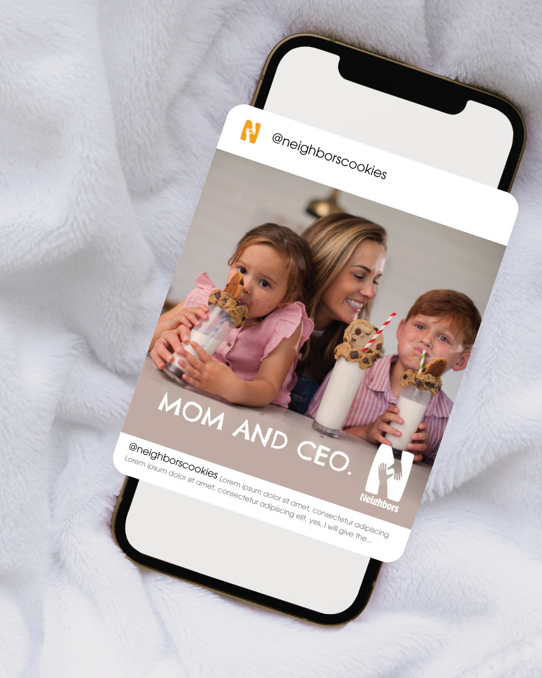
The company's original purpose, and the reason a family entered this field at all, moved to the front of every surface. Then the people: the kids running the sale, the mother and CEO, the neighbours who buy.
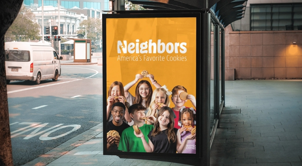
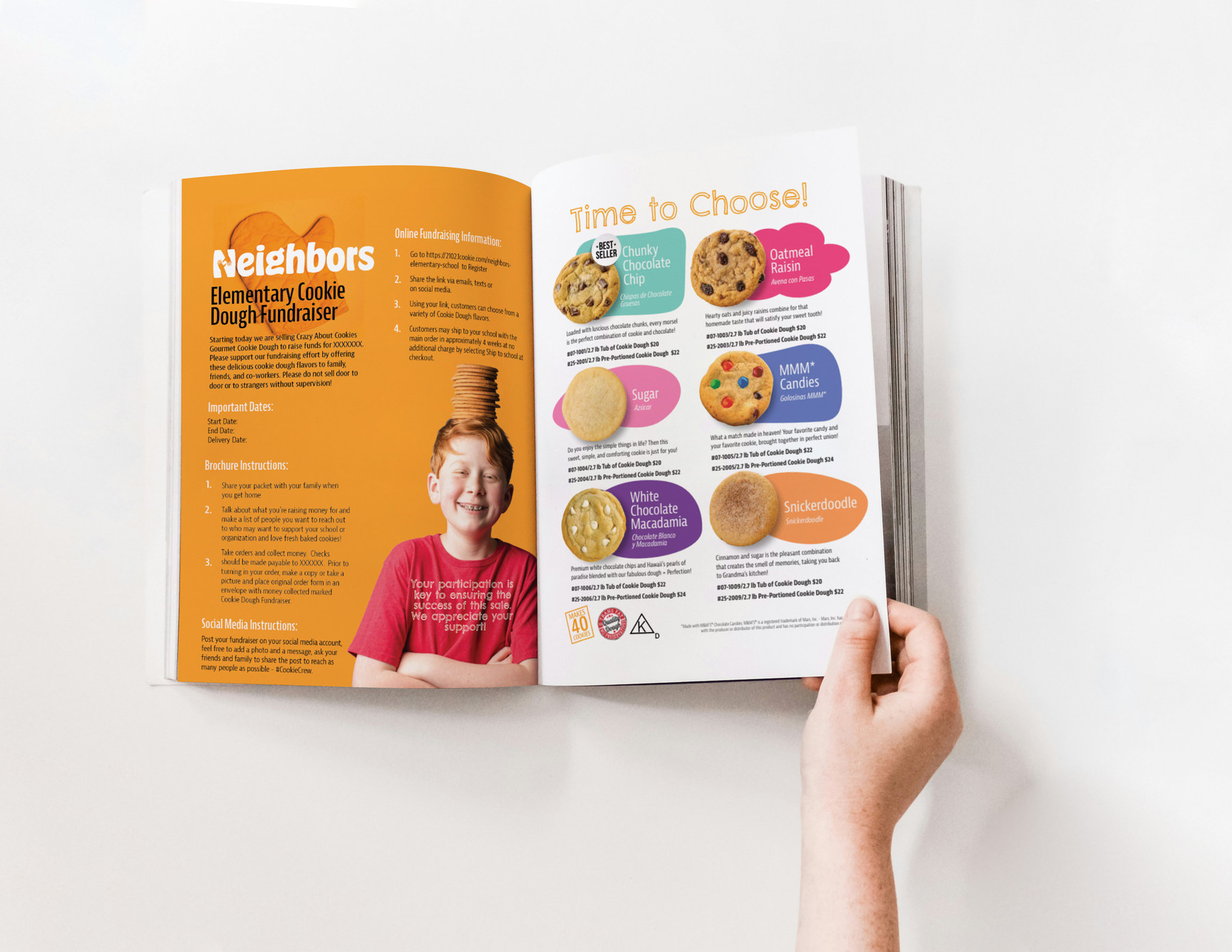
We oversaw the design of the internal platform where kids and schools place their orders. What had been complicated and administrative became a simple, streamlined path a young person can run themselves.
That matters more than it sounds. If the tool is hard, the adult takes over, and the child learns nothing. Simplicity here is the difference between a fundraiser and an education.
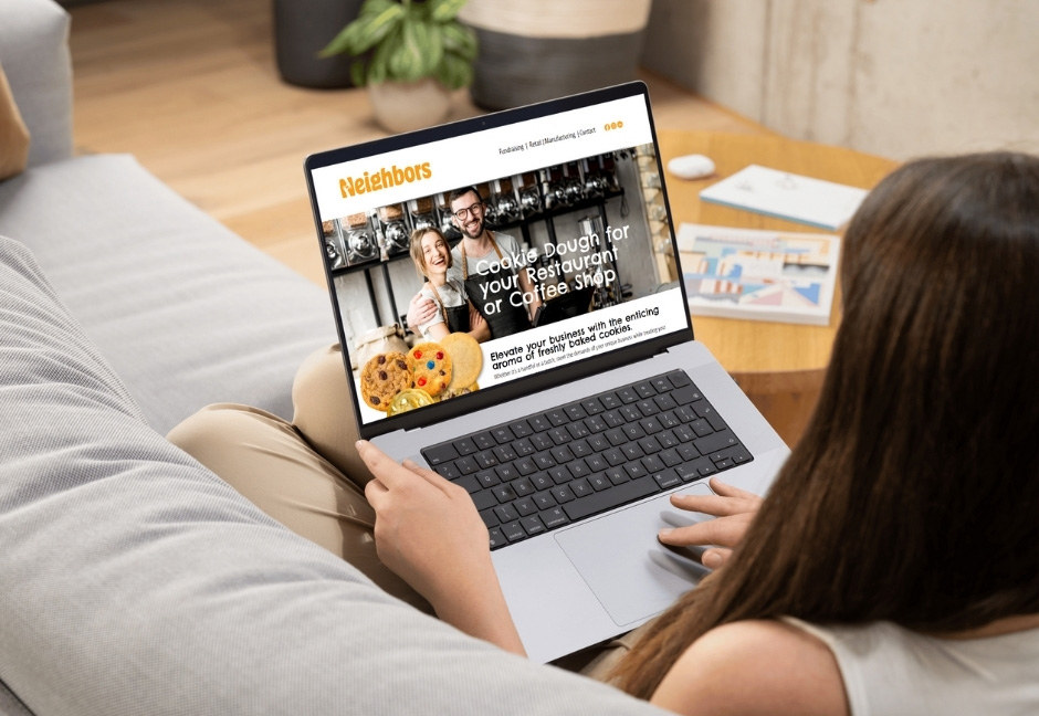
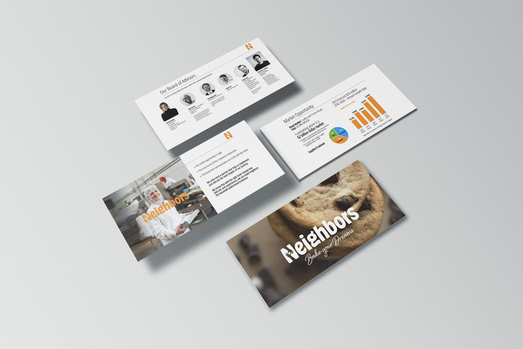
An industrial site turned into a dream factory.