Mayorga
Team
RDLB
Services
Brand Strategy
Cultural Insight
Consumer Psychology
Visual IdentityDesign
Messaging Architecture
Social Media Creative
Campaign Creative
Experiential Marketing Strategy
Content &
Copywriting
About
Pure Land, Pure Flavor: How to leverage Latin America roots in the American market.
Mayorga is more than a coffee brand—it’s a movement rooted in equity, transparency, and Latin American heritage. Built on a direct-trade model, Mayorga connects consumers with smallholder farmers across Latin America, delivering organic, non-GMO products without middlemen. Every bag of Mayorga coffee is a promise: ethically sourced, transparently traded, and crafted with respect for people and planet.

The challenge
In a saturated coffee market flooded with superficial storytelling and green washed promises, Mayorga’s authenticity was getting buried. Despite a powerful mission and direct relationships with farmers, the brand lacked a cohesive visual system and strategic narrative that could scale its social impact while competing on shelf. The deeper truth—Mayorga wasn’t just selling coffee, it was challenging the system—wasn’t cutting through.
.jpg)


The Insight
Consumers are craving more than ethical labels—they’re looking for real relationships, cultural roots, and proof of purpose. Our research revealed that Mayorga’s biggest asset wasn’t just its quality product or fair-trade practices, but its direct connection to farmers. In an age of disconnection and distrust, that human link became the emotional core of the brand.

.jpg)

The Strategy
We positioned Mayorga as the bridge between the consumer and the farmer—reframing the product not as a commodity, but as a cultural and ethical exchange. “From Our Hands to Yours” became the driving message. We elevated the brand’s pillars—Pure (natural integrity), Human (direct trade, respect), and Sabor (Latin American flavor)—into a repeatable framework that drove both design and messaging across every touchpoint.
The Challenge


The Execution
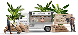
The visual identity fused rustic realism with Latin American warmth: raw textures, earth tones, and handmade typography. Photography honored the hands that harvest—placing farmers front and center. Messaging was stripped of fluff, replaced with bold, declarative copy: “Coffee You Can Trust.” “Sip With Purpose.” From Facebook carousels to product packaging and a nationwide sampling tour, every execution made the brand’s values visible.
We didn’t market coffee—we marketed a movement.