Panolini
Team
RDLB
Services
Brand Positioning
Visual Identity
Packaging Design
Brand Messaging
Illustration System
Color & Typography Strategy
Campaign Concepting
E-commerce UX
Photography Direction
Digital Activation
Sizing Architecture
U.S. Market Launch Strategy
About
Premium by Nature, Playful by Design: An innovation and market entry story built on emotional design and category disruption.

Panolini is a diaper brand created by Zaimella, one of Latin America’s most trusted manufacturers of personal care products. Founded by a family of Italian descent, Zaimella blends European design sensibility with cutting-edge “couture” diaper technology — delivering products with top-tier absorbency, comfort, and functionality. With strong brand presence across South America, especially in Ecuador, Panolini was ready for its next leap: the United States.


The Challenge
Despite its technical superiority, Panolini faced a perception challenge. In the U.S. market, products like “responsive pants” are often misunderstood as simple training diapers — not premium absorbent solutions. Additionally, many U.S. consumers associate Latin American brands with low-cost, not high-end quality.
The task: reframe Panolini as a premium, design-led, emotionally resonant brand that proudly celebrates its Italian lineage while standing tall among global diaper giants.

The Insight
The key lay in leaning into what made Panolini exceptional: Italian technology, heartfelt design, and unmatched absorbency. While competitors focused on clinical claims, we saw an opportunity to own a more holistic story — one that spoke to style, substance, and soul. By emphasizing the Italian craftsmanship embedded in the brand’s DNA, we could elevate Panolini to feel native premium in the U.S. while maintaining authenticity

.jpg)
The Execution
We built a visual and verbal world that evokes the joy and spontaneity of babyhood while elevating the brand into premium lifestyle territory.
-
Typography: The handcrafted "Boris" typeface added warmth and a sense of childhood authenticity.
-
Illustrations: Custom Italian-inspired doodles (Colosseum, Vespa, sunshine) made the brand instantly recognizable and culturally rich.
-
Color Palette: Soft, muted pastels — Mint, Pesca, Violeta, Amarillo — broke away from industry norms, creating emotional visual cues for sizes and stages.
-
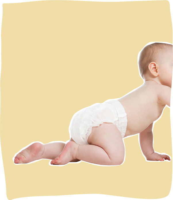
Photography Direction: Clean, joyful, baby-focused photography showcased comfort, movement, and connection.
-
Packaging & Sizing System: Visually intuitive dots and progression visuals created clarity at shelf level.
-
Messaging: “The Responsive Diaper” and “The Best Diaper, Period” led the verbal identity — direct, proud, and premium.
-
Web & Launch Strategy: From e-commerce UX to campaign rollout assets, we built a consistent, charming, and high-end experience across all digital touchpoints.
.jpg)


